Fasten your seat belts, you are about to read one of my best posts ever. (Honestly, it is true.)
I am a bit of a nerd, there is no need to try to deny this fact. I love gadgets, I love technology, and especially, I love plots. I love if they have more than two dimensions, if there is also color or even symbol shapes or sizes used to represent a third or fourth dimension. Moreover, I love GPS devices. At the moment I have a hiking GPS (Garmin GPSMap 60 CSx), a smartphone with built in GPS, and a cycling GPS (Garmin Edge 500), and I had three other ones (two hiking GPS devices, and a bluetooth GPS receiver with my previous Nokia phone) before these… But I am not the nerd who just sits in front of the computer, because I also love sports. I mean, I love doing sports, and not just watching them on TV (which I also like, but this is not the point). If you are not completely new to my blog, then you know that these days I am especially into cycling – this is also the reason why I own a special cycling GPS (which I bought basically on the morning of my first ride with my – back then new – racing bike). With Garmin (and even with other brands), you have the option to upload your workouts to the Garmin Connect website, which gives you some nice overview plots, a calendar, reports, some statistics, and maybe most importantly the ability to share what you have done with the on-line community. The plots and statistics are nice and detailed enough if you are an average – or so called hobby – user. In that case, there is no problem. But if you are such a plot-fetishist as I am, or you need professional analysis, and you have a desire for more, than you will like what I am just about to show after the break. (If you have no food and drinks with you, go and grab something before clicking on continue…)
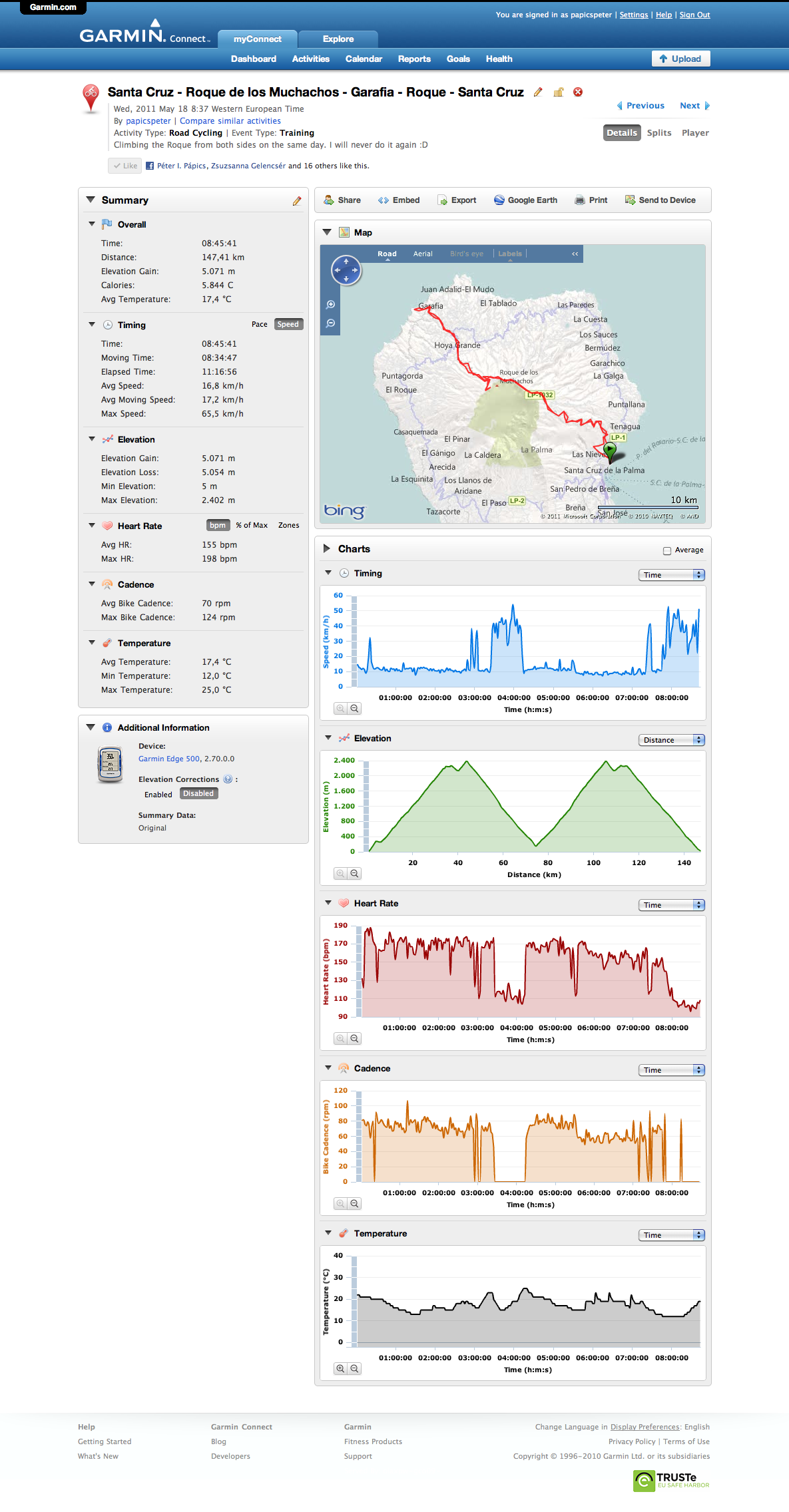
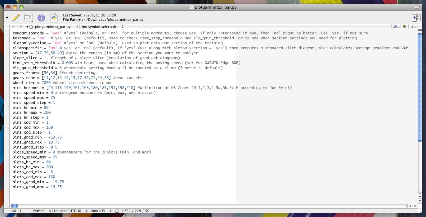
The main problem with the Garmin Connect plots (see above – and note that this time all images can be viewed in original size after clicking on them), that there is no way to zoom in the x direction, so even if you did a 30 min ride, or an 8 hour sportive, you will have the data displayed on the same width, leading to bad resolution and crowding (can you see any detail on the speed graph up there?, no, you can’t). Also, there are no histograms, though they are very handy and informative when looking at your workout. There are some free and commercial softwares and websites out there already which give you some of the options I miss, but when I gave them a try, I quickly uncovered some of their shortcomings, which forced me to come up with my own solution instead of living with annoying problems of existing analysis tools. As I use the python language at work (which is by the way an open source, free solution with a huge community standing behind the development, plus it has an extensive plotting library), I decided to write something which does exactly what I need, but can be used later by other Garmin users too. So my strategy was to construct a script, which reads in data from the XML file which comes from the Garmin Connect website (I do not deal with the original file from the device, because that is encrypted, while the XML structure is easy to work with and contains the same information), does all the needed analysis and plotting, and uses a parameter file (see below), which enables the input of personal details (like heart rate zones, bike details, etc.) and the change of some given parameters (e.g. plotting limits, histogram resolution, plotting modes, thresholds, etc.) in an easy way without touching the script itself.
So let’s assume you already have your personal details in the parameter file, and – from experience – you have your favorite plotting settings (which I have for months now, and I never change them because they seem to fit all situations), then you do not even need to touch the parameter file to process a new workout, you just open a terminal (sorry for my Windows user readers, but the script works only on Max and Linux systems), go to the folder where you have the script file, the parameter file, and your workouts, and type the following:
>python plotgarmintcx.py 'activity_86515505.tcx'
This will start the read in, the analysis, and the plotting, and after some time (1-5 minutes depending on the length of your ride, and the speed of your computer), you will have all your plots and statistics nicely arranged in a corresponding subfolder with no additional input needed from your side :) The only thing which has to be calculated by the script and is not directly read in from the data file is the slope gradient, and as it is a bit noisy, I also smooth it with a box which is a 100 meters wide. Also, if you are interested in total time, or moving time, you need to handle the data in a different way. Luckily these conditions can be very easily and nicely handled with the structures of python – so of course these things are also included.
So let’s see the different (high resolution, print quality – don’t forget you can click on them and check out the original versions) plots I produce.
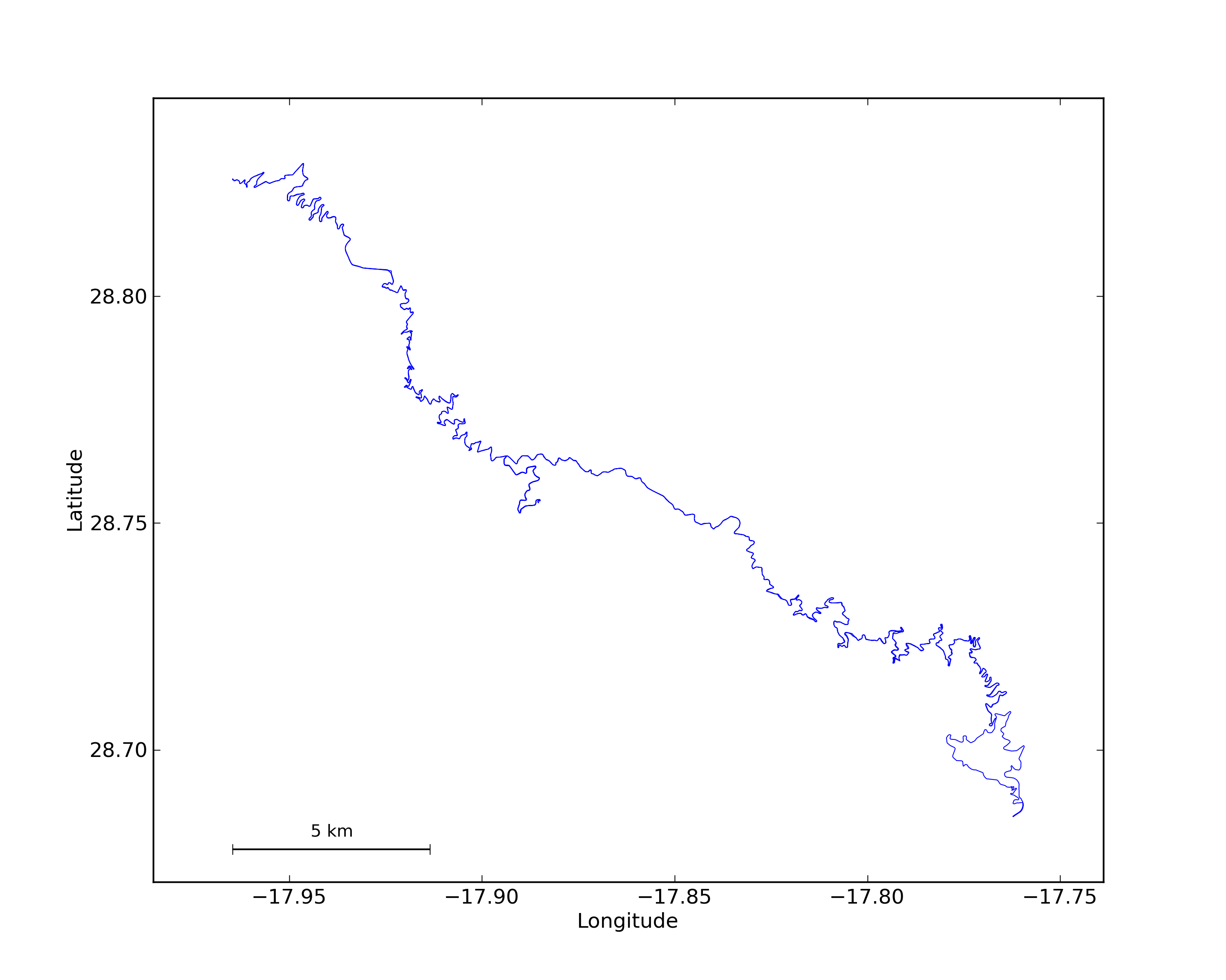
First of all, there is a map produced (with scales), which just shows you the track you did (maybe I will put an OpenStreetMap background on it later on, but I do not really care about this output, it was made only to experiment with the handling of longitude and latitude data in python). The nicest thing is the scale which is also displayed, and the map is plotted in a way that in the center this scale is valid in both the latitudinal and longitudinal directions. Also, the length which is used as the scale is always an integer kilometer till the point when the width of the map would be too small (so the ride does not cover much of a distance in the E-W direction) for it. In such case it is displayed in meters, and is always close to the 1/4th of the full width.
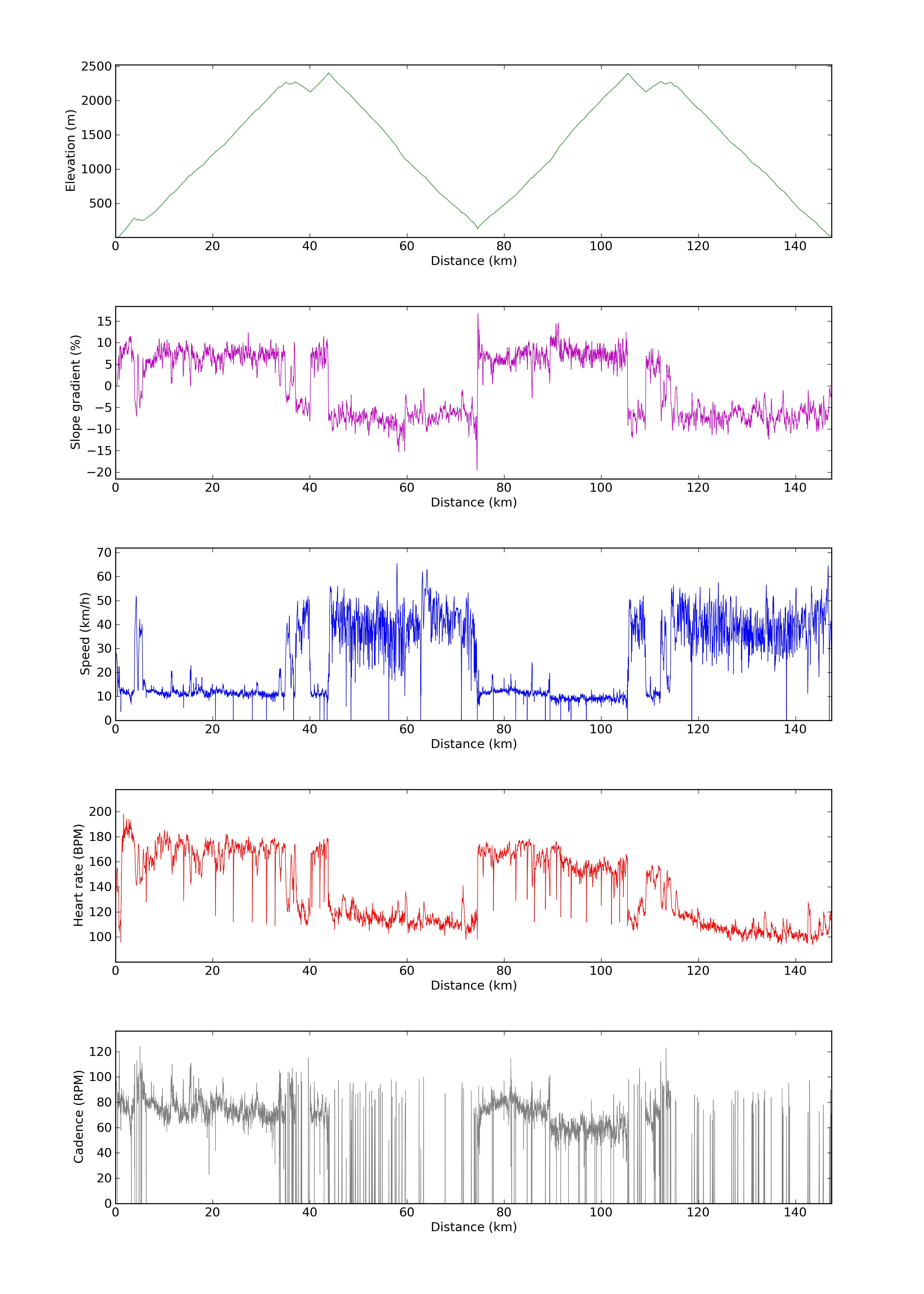
Then there are overview plots (elevation, slope gradient, speed, heart rate and cadence versus distance, time and moving time), which basically show you what you already saw on Garmin Connect, but already with a much better detail and quality (and it fits an A4 page perfectly, if you want to kill the rain forests, which I do not suggest…). I show you the one where the values are plotted against the distance.
But as I like to see the different measurements (elevation, gradient, speed, heart rate and cadence) together, I also produce plots (versus distance, time and moving time) where these are displayed on one figure with multiple axes, so the connection between different values or their change can be seen much easier. I produce one plot wich covers the whole workout (but gets longer if the workout is longer, not like the Garmin Connect plots),
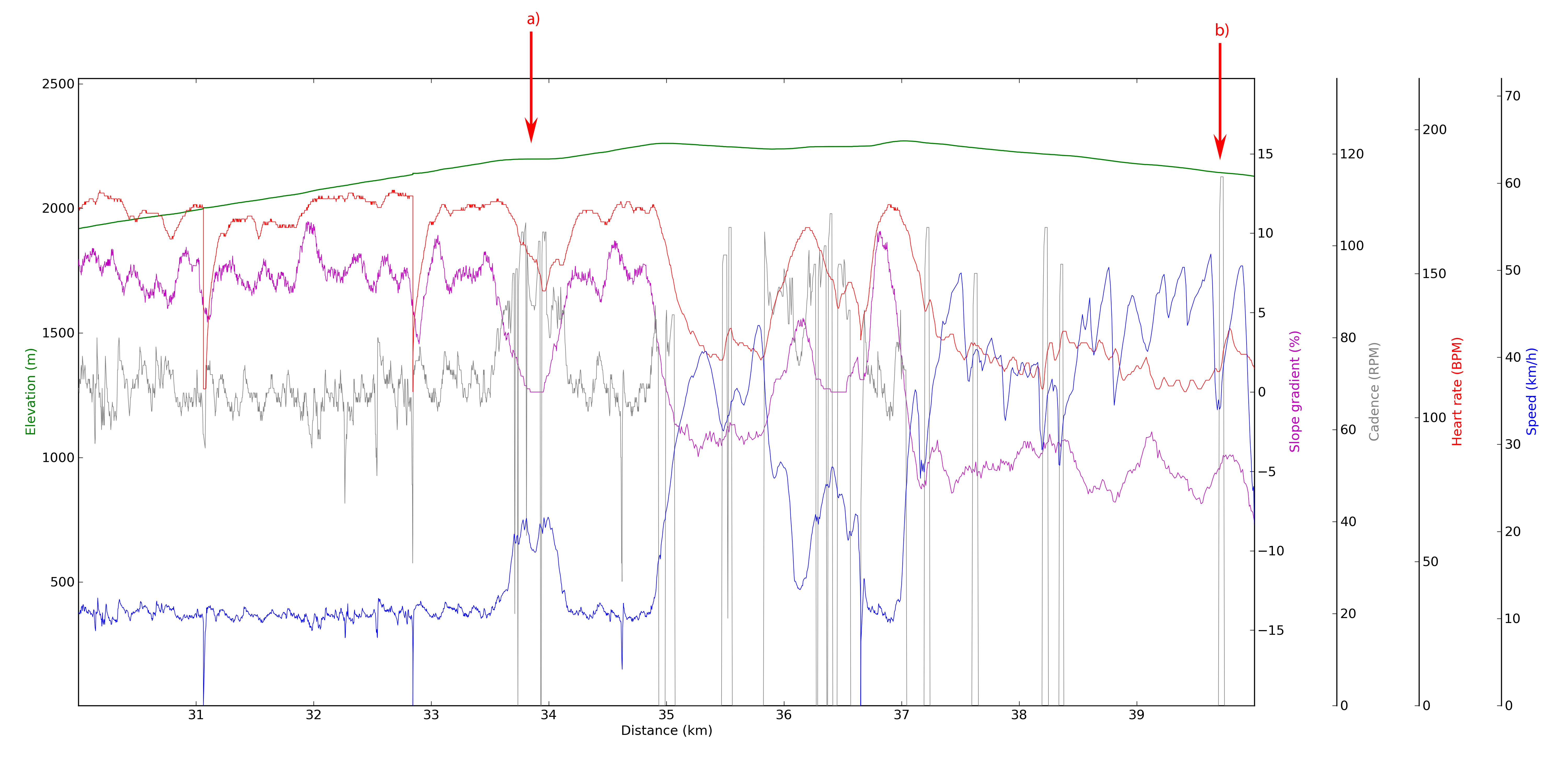
but as this can easily be 20000 pixels wide even though it is plotted in lower resolution (and even I can not handle such a thing easily, but it would look very pretty on the wall), I also produce the same plots in slices of given lengths (you can see an example below) and given time intervals.
I have marked two places on this slice. At a) you can see how nicely the heart rate, the gradient, the speed, and the cadence are correlated (the latter two change to the opposite direction compared to the first two) when you are doing a steady climb. If the gradient drops, your heart rate will also drop, as the climb gets easier (and after 2000 m of elevation gain, you don’t start pushing), and the speed rises with the cadence (if you do not shift gears). At point b) you can see that I am rolling down with 0 cadence on a curvy road (the sharp curves are the sudden drops in speed, with a steady acceleration – caused by gravity – afterwards), and where the arrow mark is placed, you can see that right after the minimum in speed, I started pedaling to speed up as I was coming out of the curve. It is really nice that you can see such details.
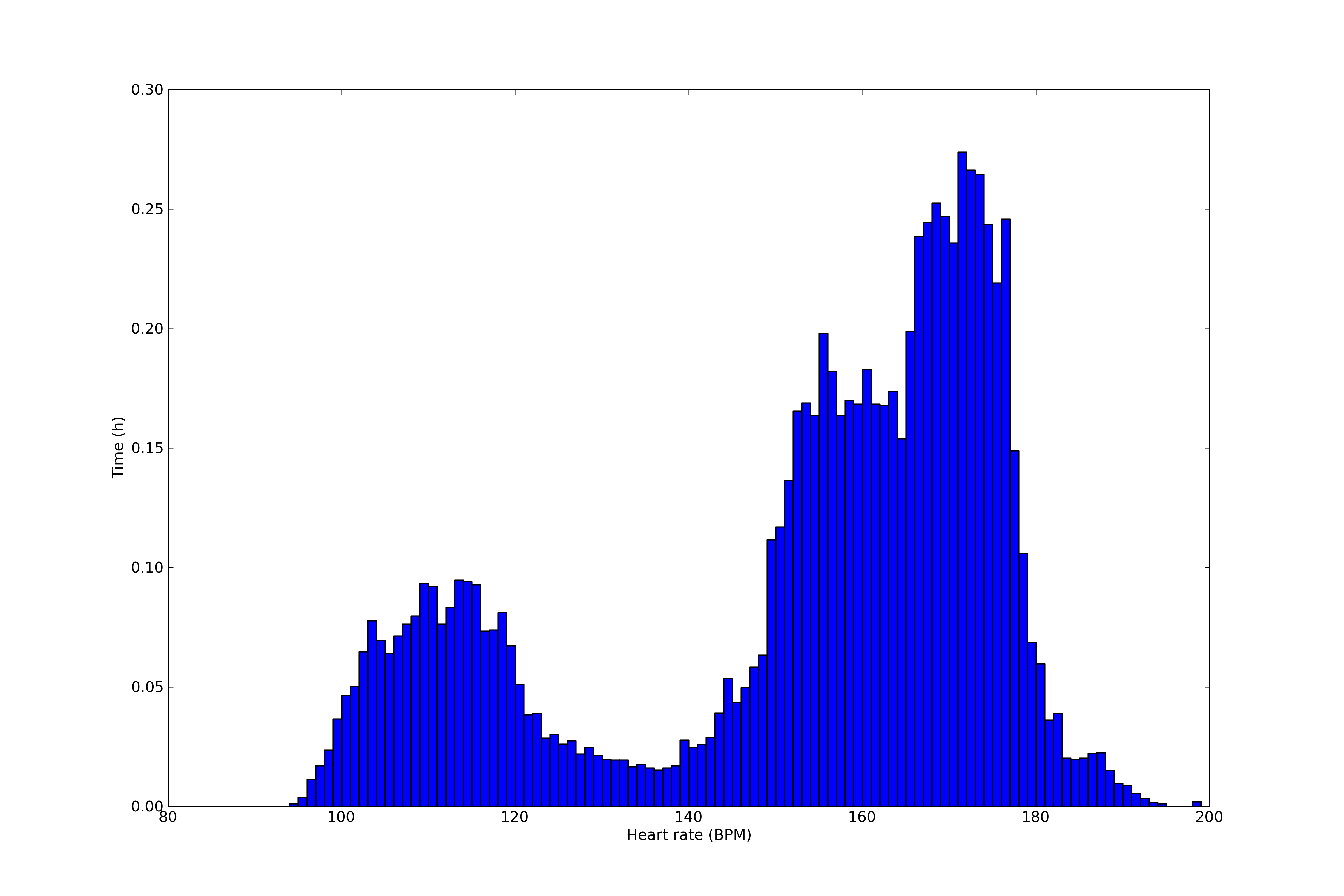
Then there are simple histograms (of time) showing barplots of the distribution of the gradient, the speed, the heart rate (and the time spent in heart rate zones), and the cadence. As an example here is a heart rate plot (with the first hump corresponding to descents, and the second one for the ascent on that day).
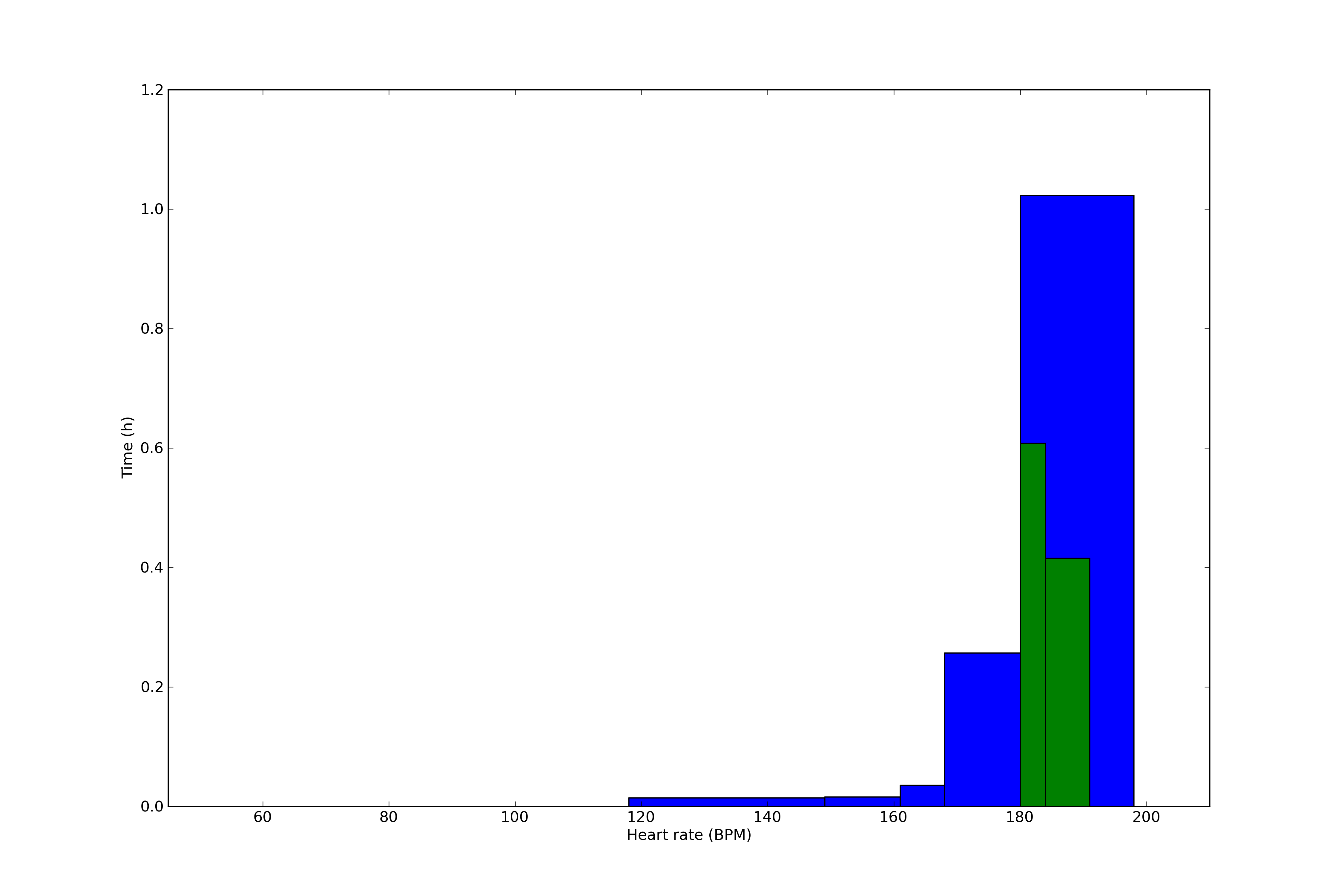
The histograms can tell a lot of your workout, e.g. steady efforts on flat terrain produce close to normal distributions of heart rate, speed, and cadence, while alternating climbing and descending sections produce these double peaked distributions… Seeing how much time you spent in your personal heart rate zones is also very important. (The plot below is from another day than the plot above, do not get confused! The green bars are the 5a and 5b – and there is nothing in 5c – zones within zone 5, which is the largest blue bar here, as this was a full intensity time trial effort from this week.)
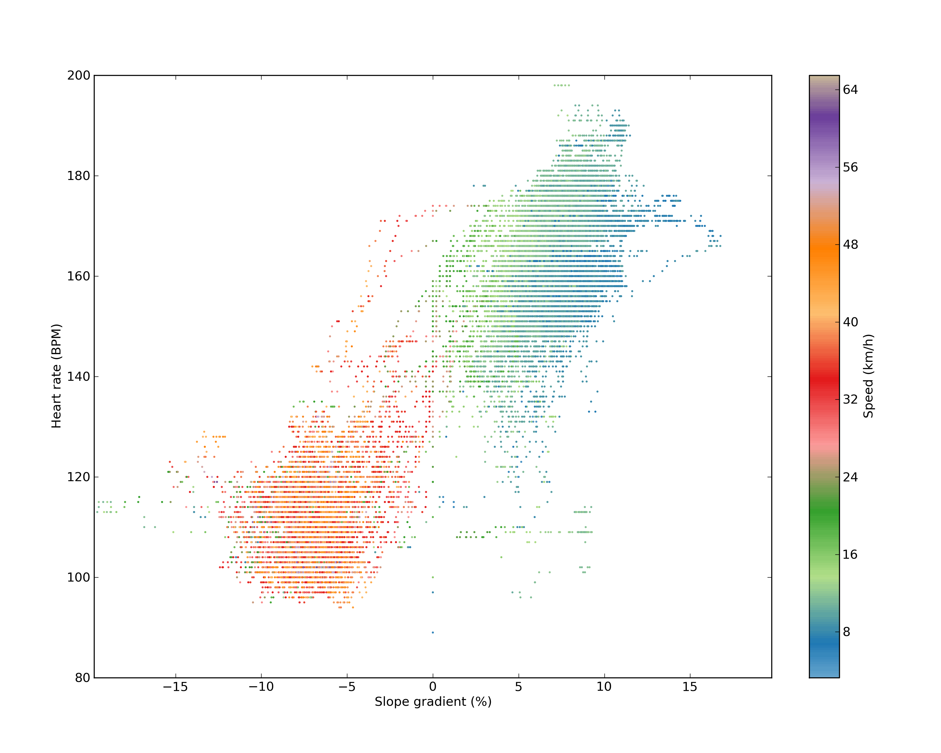
Then there are so-called 3D plots where 3 of the 4 metrics (gradient, speed, heart rate and cadence) are shown (the third with color). I think they are pretty self-descriptive. It is a great way again to show correlations in the data.
On the plot above you can perfectly see how the descents (bottom left) and ascents (top lefts) are separated in this parameter space. Descents have low heart rates, high speeds, and of course negative slope gradients. I truly love these plots. And again, different rides show different structures. Of course a time trial on a flat course will not be interesting on this 3D plot, but it will be informative on another one.
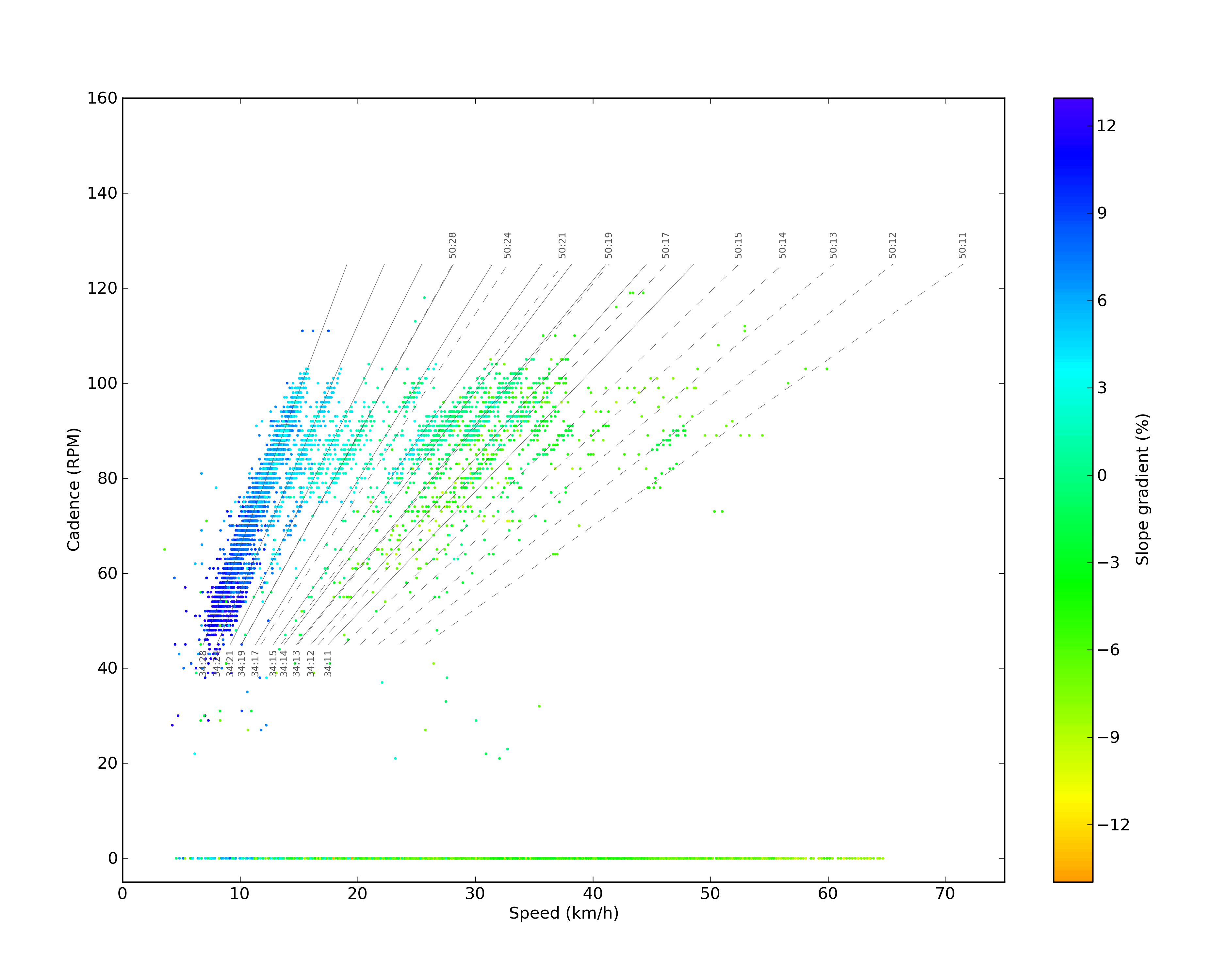
This one above on is again very interesting (it’s from another day of constant climbing and descending). You can see that first of all there is the lower red section, which is just rolling with various speeds. Then as you go higher along the y axis (and the gradient gets positive, and then steeper and steeper) the speed starts dropping along a linear (and the heart rate starts to be higher). Then as we reach a gradient of ~5%, the linear relations stops (there is something like a break point there), and another relation takes over along a much steeper linear. This probably has something to do with the fact that on that day I have used the smallest gear at and above 5%, and as there is no way to shift gears beyond that ratio, there is no way to get into a more comfortable rhythm on a steeper slope Speaking of gear ratios, have a look at the plot below:
As you can see, the data points are distributed along the theoretical speed-cadence curves, which are set by the number of cogs on the front chainrings and rear cassette. Also, the colors prove that I use lower ratios while climbing, and higher ones while pedalling downhills. Simple and beautiful.
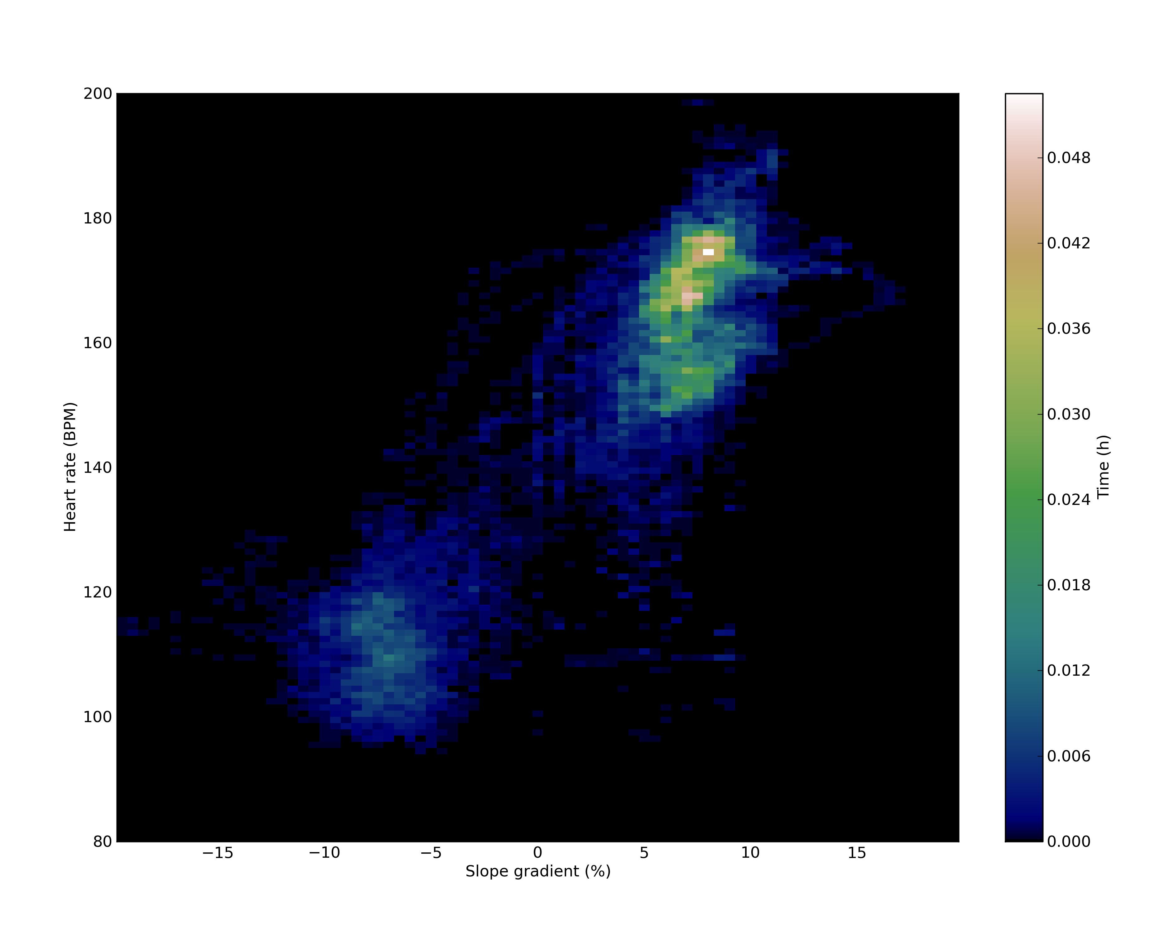
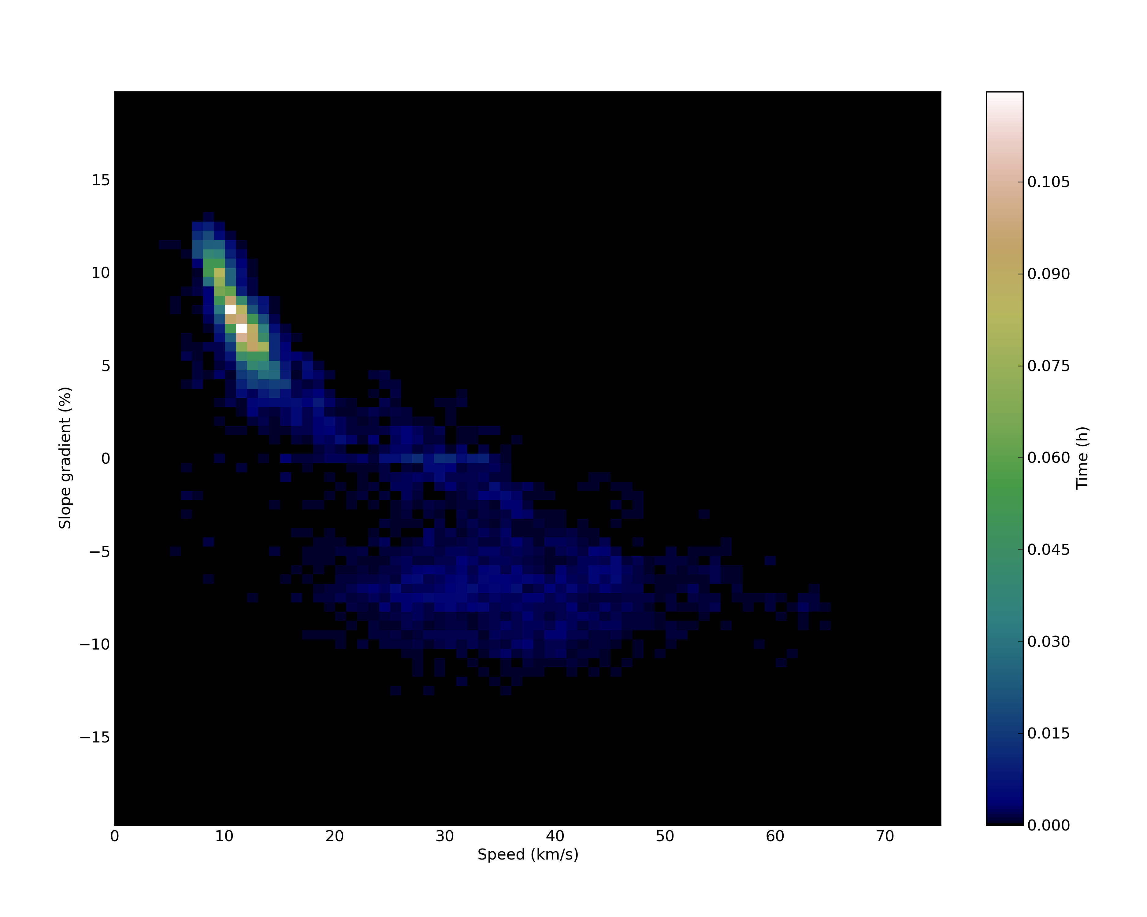
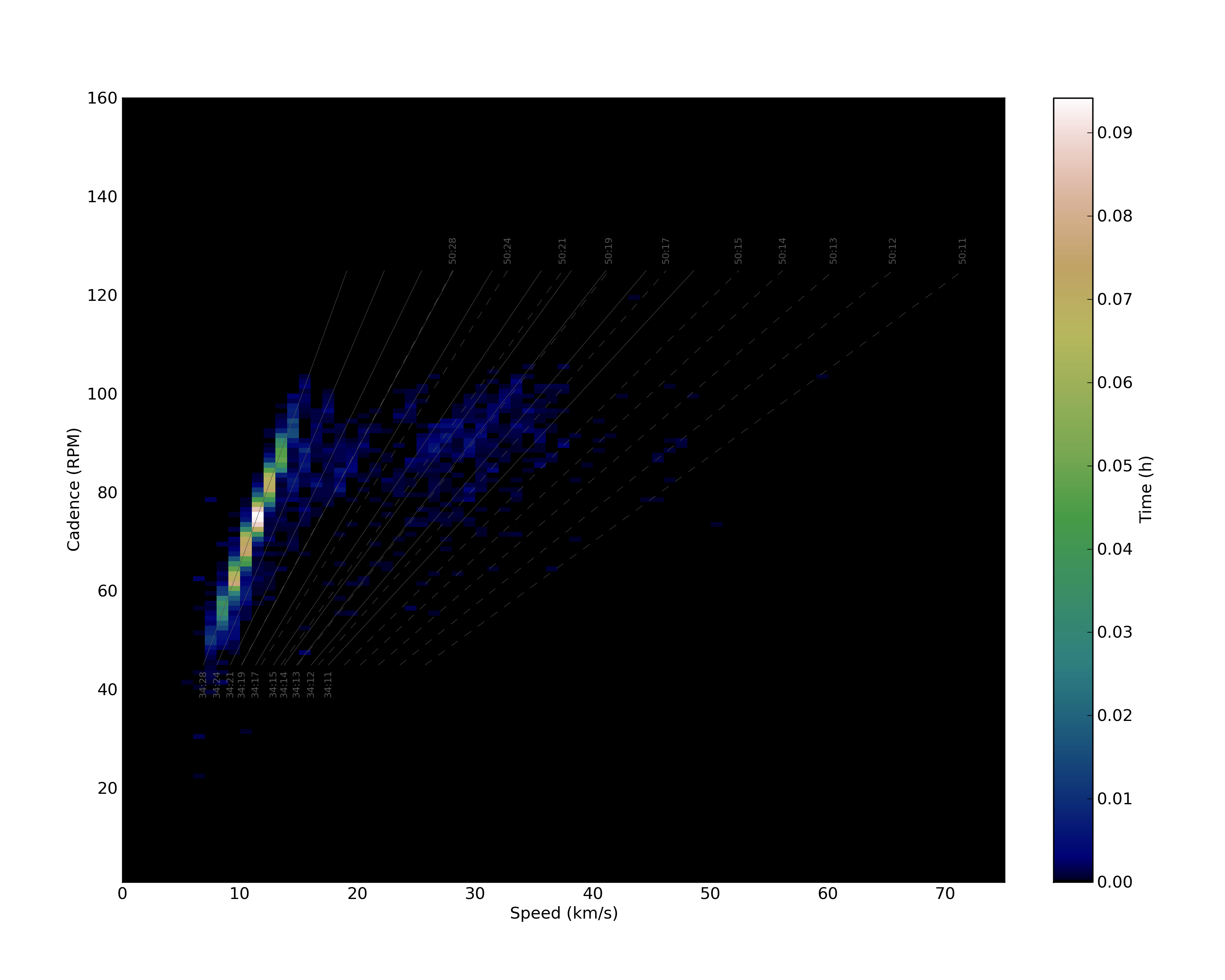
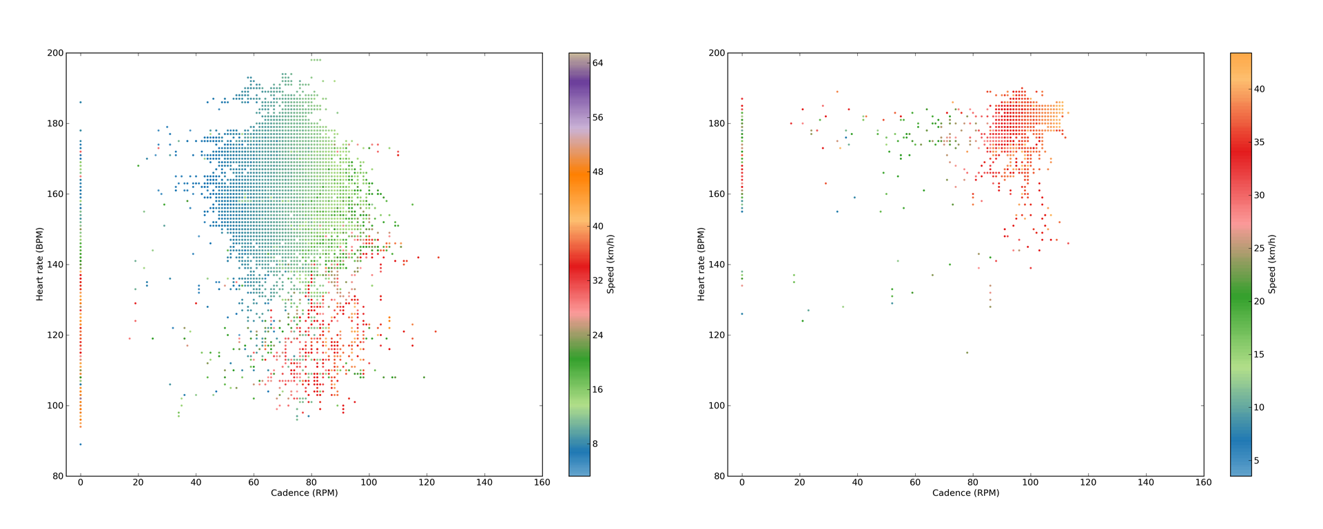
The only problem with these, is that the symbols are plotted on top of each other (signs of this can be see on the 2nd example 3D plot above), so when you have a longer ride (which is better for the visibility of clusters in the data), then the data points from the end of the ride will be plotted over the data points from the beginning… This is especially the problem when both the x and y axes have metrics which can only have integer values (like cadence versus heart rate), because then over-plotting happens pretty soon. Still, as there are quite good correlations existing between given metrics, it is very likely, that an older point will be over-plotted with a very similar more recent one. Still, if the recording was not done with the recent ‘every one second’ option of your device (so if the data is not equally spaced in time), then the density of groups will not be correlated with the time spent in these 2D areas of the 3D plots, so to visualise how much time was spent around a given x,y combination of two of the four metrics, I also produce 2D histograms (see the three corresponding ones for the above 3D plots below).
Though it was not that evident from the 1st 3D plot, now you can see that much more time was spent in the climbing sections (upper right cluster).
Again, it is clear now, that most of the time was spent in the low speed steep gradient section, sweating on the climbs.
And again, most of the time I was pedaling using the easiest gears. There is no need to explain these further, but it is very easy to see, that using these (there are 6 different 2D histograms) together with the 3D plots (12 different ones) is again very handy and immensely informative :)
The nicest thing about these plots is that the limits, the scales, the colors are always the same (if you use the default setting of the parameter file – when the comparison mode is on), so if you want to compare two workouts, then you just place the corresponding plots next to each other (or – what I prefer to do – blink them on the screen), and voi là (see a comparison of a mountainous ride from La Palma with my good time trial effort from this week below)!
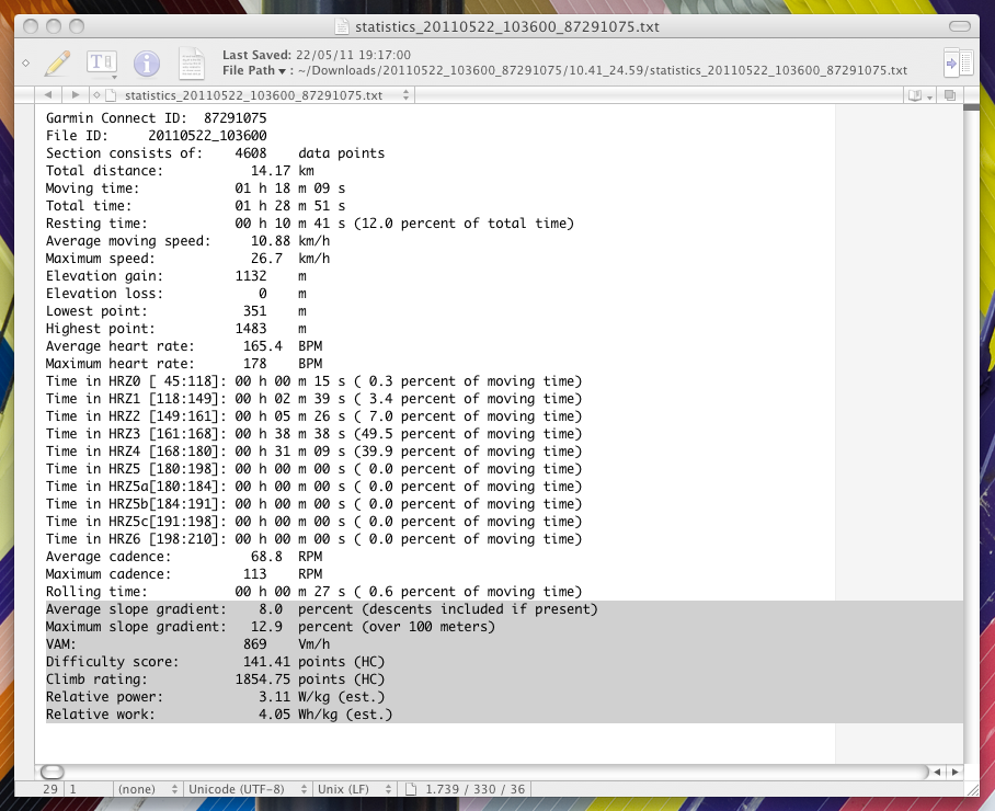
Then at the end, a file with all the statistics is also saved. If you ask for climb specific analysis (again, via the parameter file), then on top of the previous things (plots and statistics of the selected section, all nicely placed in a subfolder within the workout’s folder – so usually I just run the script for the whole data, then I run it for the selected climbs), the statistics will be more extensive (with estimated power and climb difficulty ratings – which also classify your climb, and – to make things even more precise – these categories are fixed to known difficulty categories of climbs on the Tour de France, based on this post). You can see a sample statistics file below, with the climb specific parts marked on the bottom of the file.
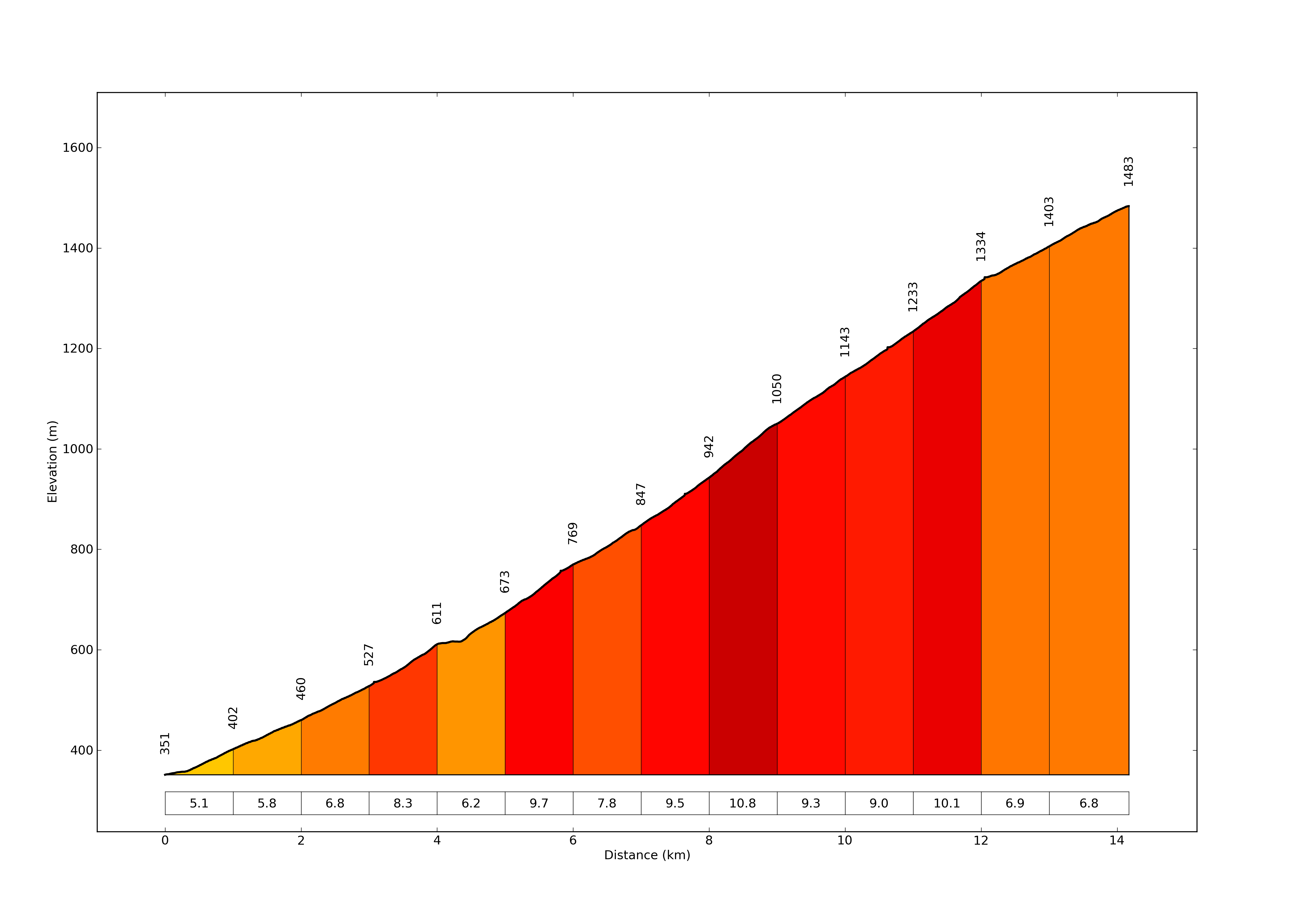
The difficulty score is calculated according to the formula of climbbybike.com, while the climb rating is based on the simple, but yet very logical formula of Dan Connelly. The relative power is calculated from a widely used estimation, which can be found also on Wikipedia. And, at last but not least, a nice gradient plot will be also produced for your climb section. Very professional!
This immerse amount of plots and statistics is what I want to see after I go cycling ;) If you like what I did here, just leave a comment, it is highly appreciated! And now go and ride you bike for God’s sake :D (Ps.: if you were wondering, the script itself is ~1500 lines of code, but most of it is just plotting…)
The script is available on GitHub.


A very impressive post. You seem to be an expert in everything you deal with.
Thanks mom ;)
Great comprehensive post. Why not wrap it in a nice gui? Is it not feasible to have the power estimate over say 60 sec intervals during the climbs, so you can graph HR vs power? That should actually show your threshold power.
Thx. The 60s thing would be possible, but maybe it is better if I just wait till I have a power meter (Christmas?), and then I will implement the power-specific calculations and plots too ;) For the GUI: not now (I do not even know how to do it), but maybe in the future…
really nice work,
I’m unable to download the script
elevation grade plot is what i’need for report all ascent in my area…
Thanks! Sorry, but the script is not available on-line at the moment, as it is not a finished ‘product’. I would need to write a GUI around it and remove the dependencies from the code which make it impossible now to run it on personal computers…
Nice Work.
Can you share a source snippet of how to draw using more than two y-scales as in plotvdistance_part04? Thanks
Thanks. I used the method described here: http://matplotlib.sourceforge.net/examples/pylab_examples/multiple_yaxis_with_spines.html
Hey there,
this work is amazing,
Im looking at extrapolating data exactly like this for an architectural design project for uni for example, chopping up a cycling workout graph and overlaying certain sections to create a new relationship between programme in a 3D mode. If you would give me permission, may i use your full workout plot (the long one) in doing this by reprodcing sections of it as a bar graph? I do not know how to script so this would be extremely extremely helpful as i cannot produce graphs like this myself..
This is amazing! I really want to try out this script! When are you releasing it? Is there a small script were I can get the Gradient Plot? I’m in serious need :) :) Cheers
Hey Peter,
Great post. Wondering if you are considering making this available in some form?
I have similar visualisation challenges with the Garmin Connect site, even though it provides the basic functions required.
Regards,
Keith
I am happy to send the python source code for anyone under the GNU GPL licence :)
Hi Péter, can you send me your source code? I’m interestend on the statistics on heart rate, for trying to compute a sort of TSS. (stava suffer score is a bit crappy in my opinion)
Thank you very much!
Cheers
Very nice work. I greatly enjoy cycling and am trying to learn python better and would love to be able to do so while analyzing data from my other passion. I would be happy to use under GNU GPL licence and would greatly appreciate if you could share.
Thanks
Nice one! Would be great to share this with the interwebs. I am also interested in a heartrate curve. This would be similar to Strava’s power curve. So it gives the maximum heartrate I can sustain for a certain time. When I have this data (for example average heartrate of 185 over 60 minutes), I can use this when climbing an 1 hour mountain.
That is actually a good idea, and although I am not really developing this anymore, I might implement it, this should not take longer than a few minutes :) Then maybe I should just put this thing up to github.
NIce. Would be interesting to see your python code on github. Mine is here: https://github.com/cast42/powercyclingmodels
Lode
http://www.strava.com/athletes/505183
I will really try to put it up soon!
Any chance of getting a copy of your code? Very interesting results.
I just put the code on GitHub, feel free to look into it at https://github.com/papics/GarminPlotter
Thx for sharing your code on github !
Hello,
Does the script still works?
First run gives an error:
” File “plotgarmintcx_outdoor.py”, line 211, in
lon = lon_all[0]
TypeError: ‘float’ object has no attribute ‘__getitem__'”
Thx,
Rgds,Seb
Hi, I actually noticed this a few weeks ago, I think Garmin changed something in the XML export… I am not using the script anymore, VeloViewer and GoldenCheetah can do basically everything what this script does, and I am too busy with other things to keep this up to date. I can not promise that I will solve this issue in the near future, sorry.
ok thx for the reply!
I’ll try to look at it, but python is new for me ;-)
i just wanted to find a way to have a csv file with, per activity, time spent in zone (my zones);will see those tool also, thx.
rgds,
S
Peter,
Thank you for taking the time to share this analysis. I enjoyed reading the post.
Golden Cheetah is a powerful app as you mentioned.
I’m currently using Python to look at Strava data and analyze local trail (Silver Comet Trail) utilization and local road route connections to the trail.
Interesting the things you find when you start drilling down into the data.
I’m a retired engr, keeps me busy.
Regards,
Chris
Hi Chris, I am glad that you found my post useful :) Good luck with your own coding and analysis!