Tag Archives: postdocinleuven

Panning photography: Eneco Tour 2015 – Stage 4 (ITT)

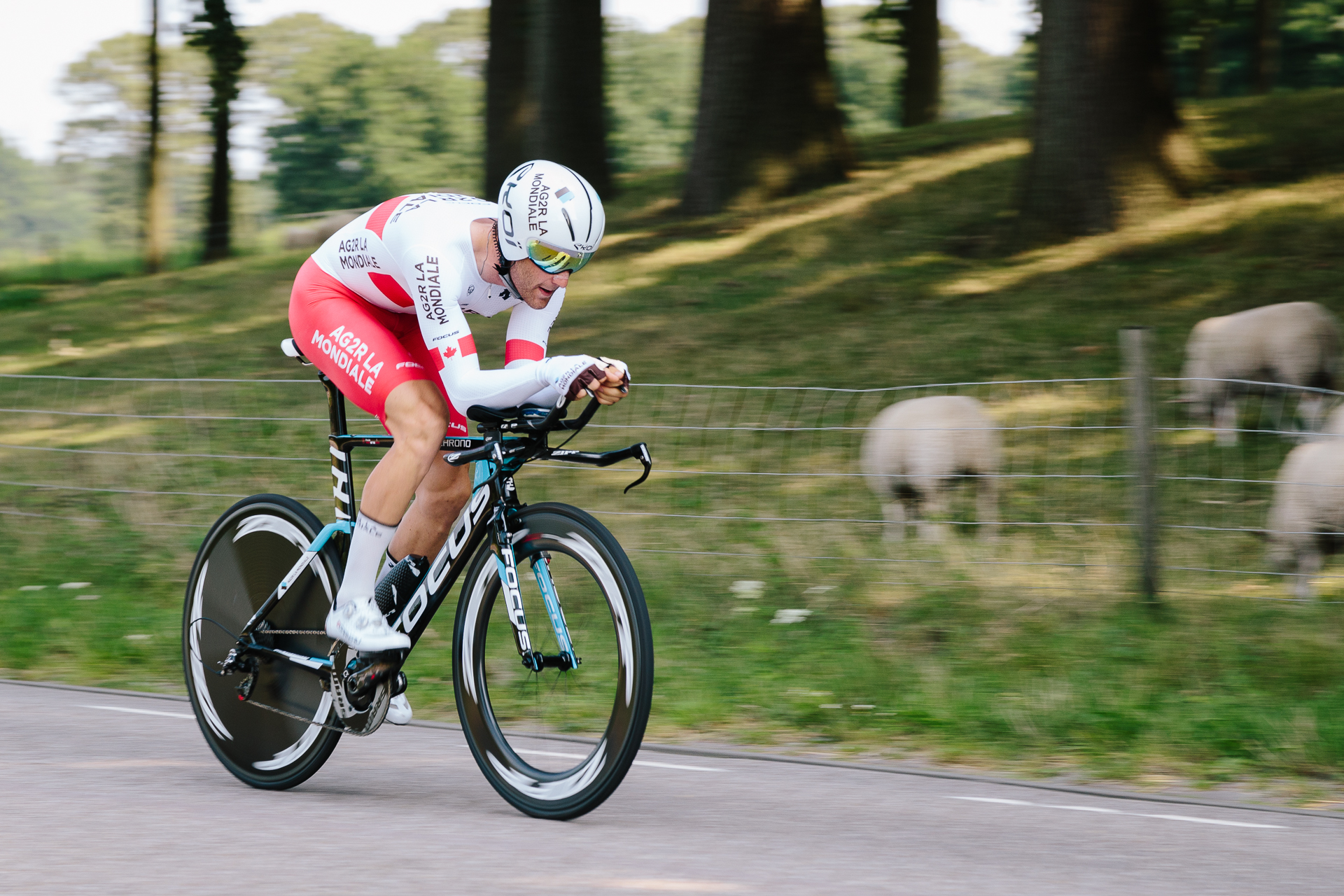
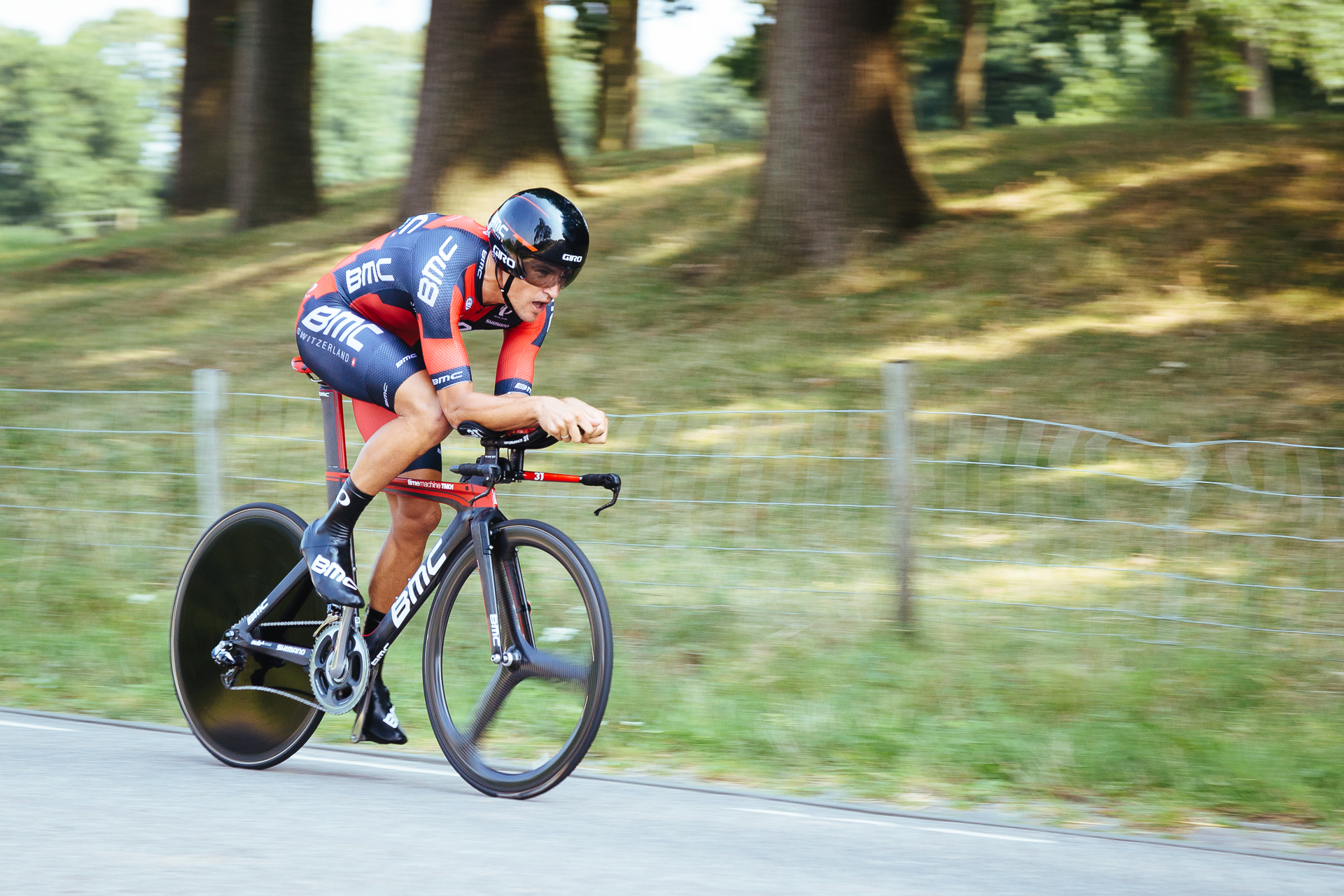
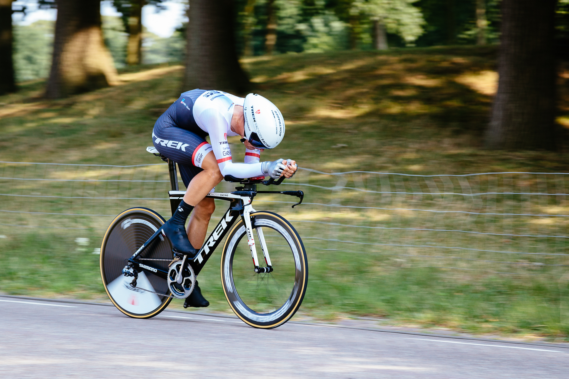
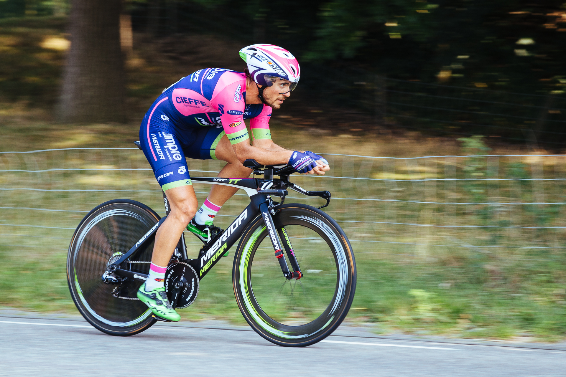
There are only two (not one day) UCI WorldTour-races (the highest level cycling events) between the Tour de France and the Vuelta a España, first the Tour de Pologne, then the Eneco Tour. The latter goes through Belgium and the Netherlands, so it is not too difficult to go and watch a stage. The last time I took pictures on a cycling race was back in 2010 during the first stages of the Tour de France, so I was happy to go along with Nadia to watch the individual time trial (ITT) of this year’s Eneco Tour just over the border in Hoogerheide, and try my luck in panning photography.

We parked in the neighbouring village towards the southern sections of the 13.9 km long course, so we had no problem with the crowds around the start and finish area in Hoogerheide, and after a short walk, we managed to find a nice section to watch the race. From a photographer’s point of view, we had to be standing on the right side of the cyclists, so the pictures show the chainrings and the derailleurs, and also preferably in the shade, since colours are nicer there when the Sun is high up in the sky. After finding a suitable spot, we just had to wait for the 152 cyclists to pass one-by-one, which took three hours.

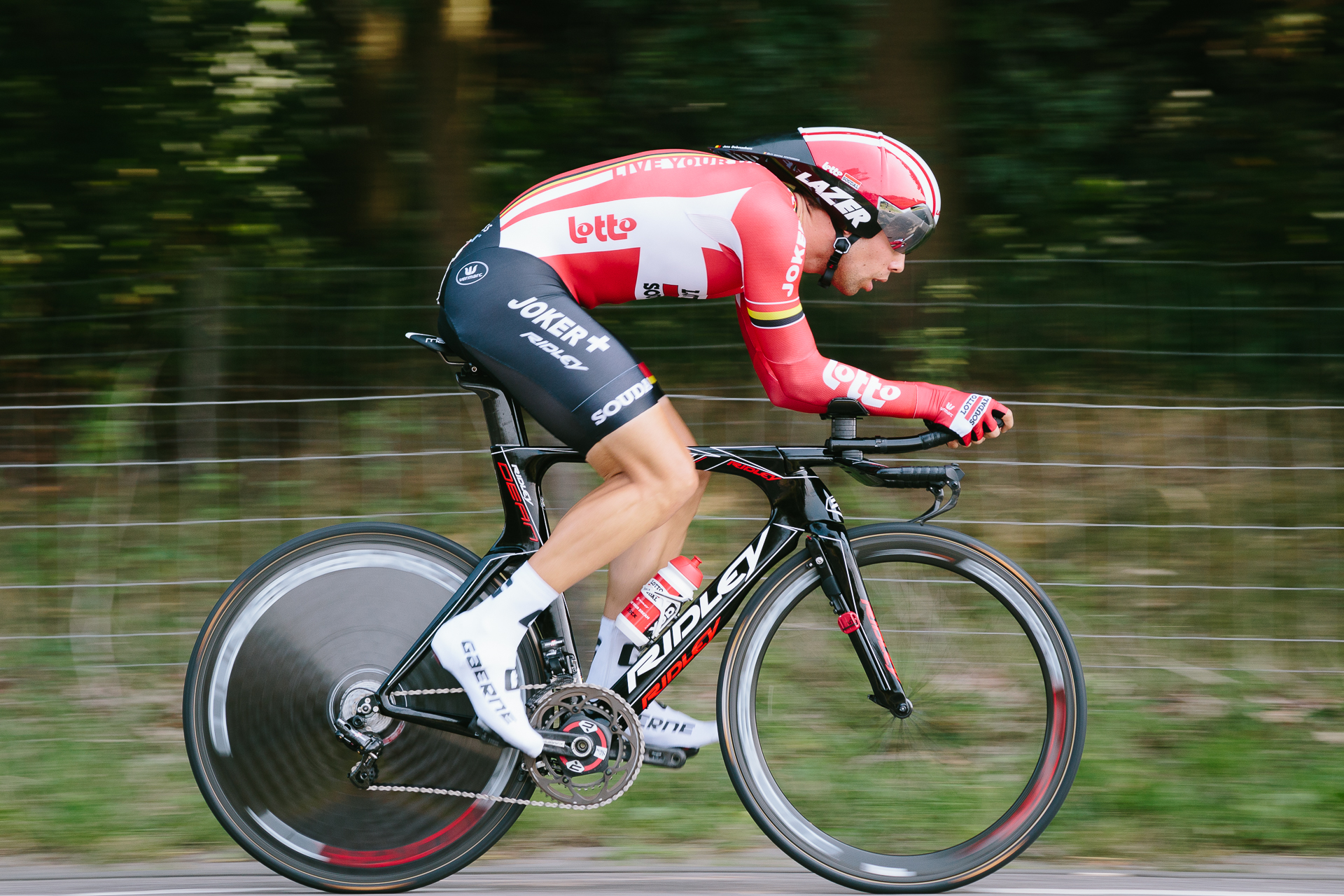
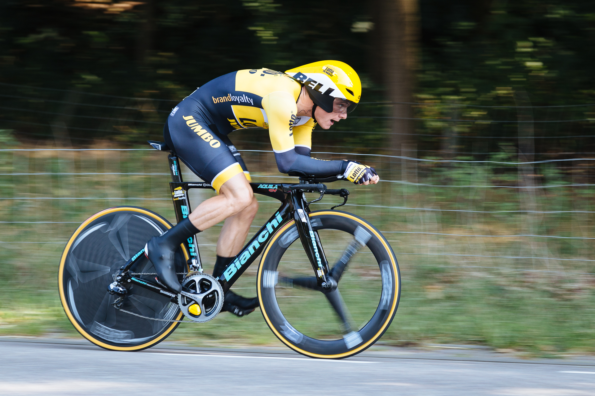
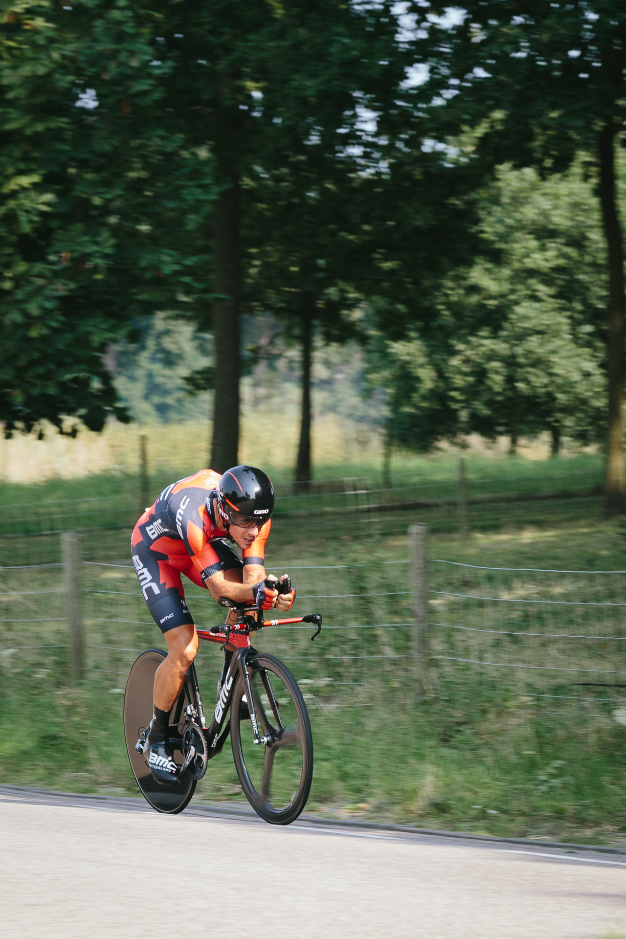
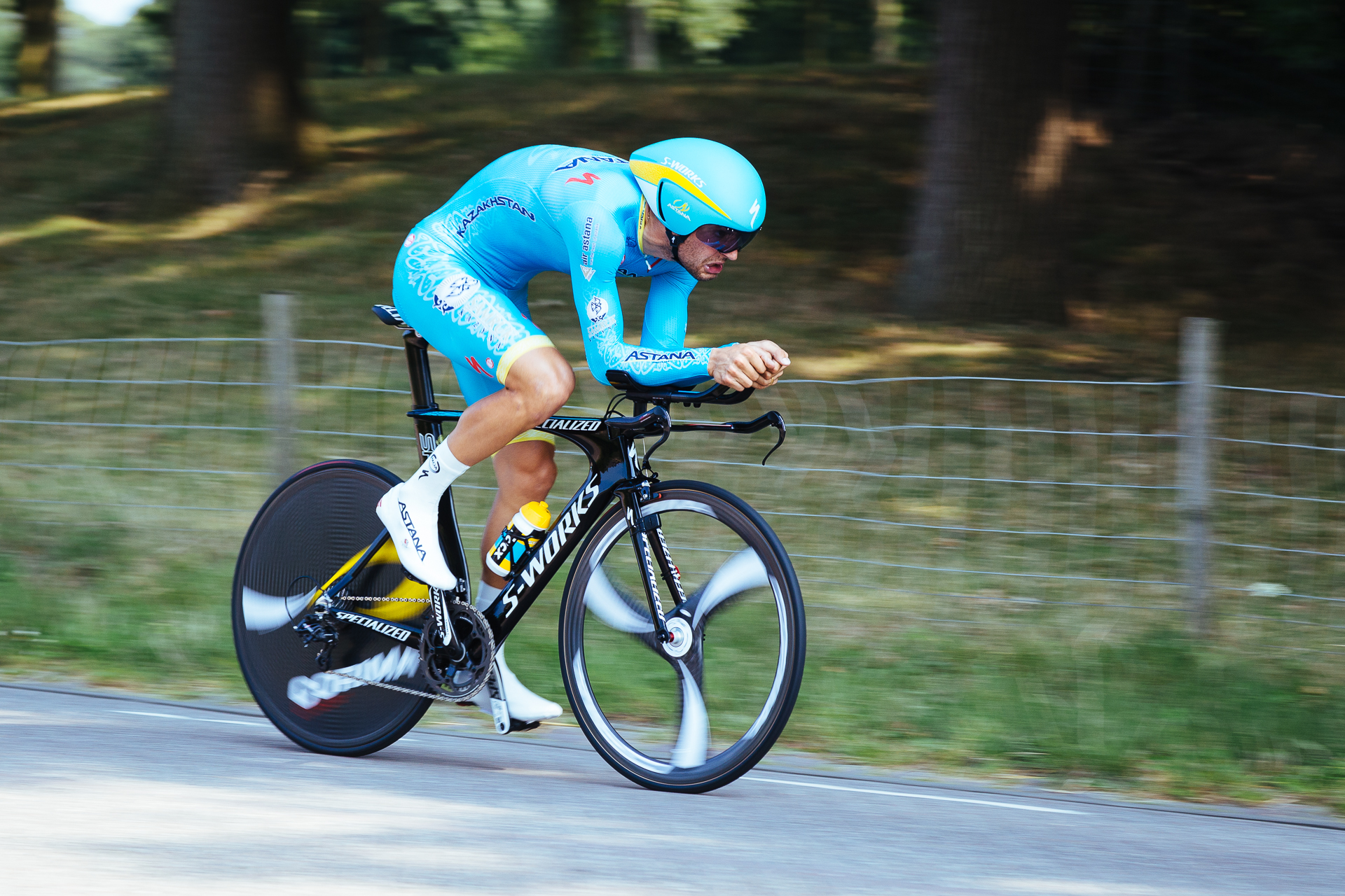
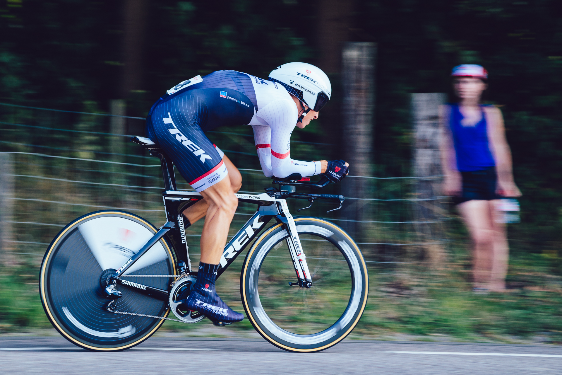
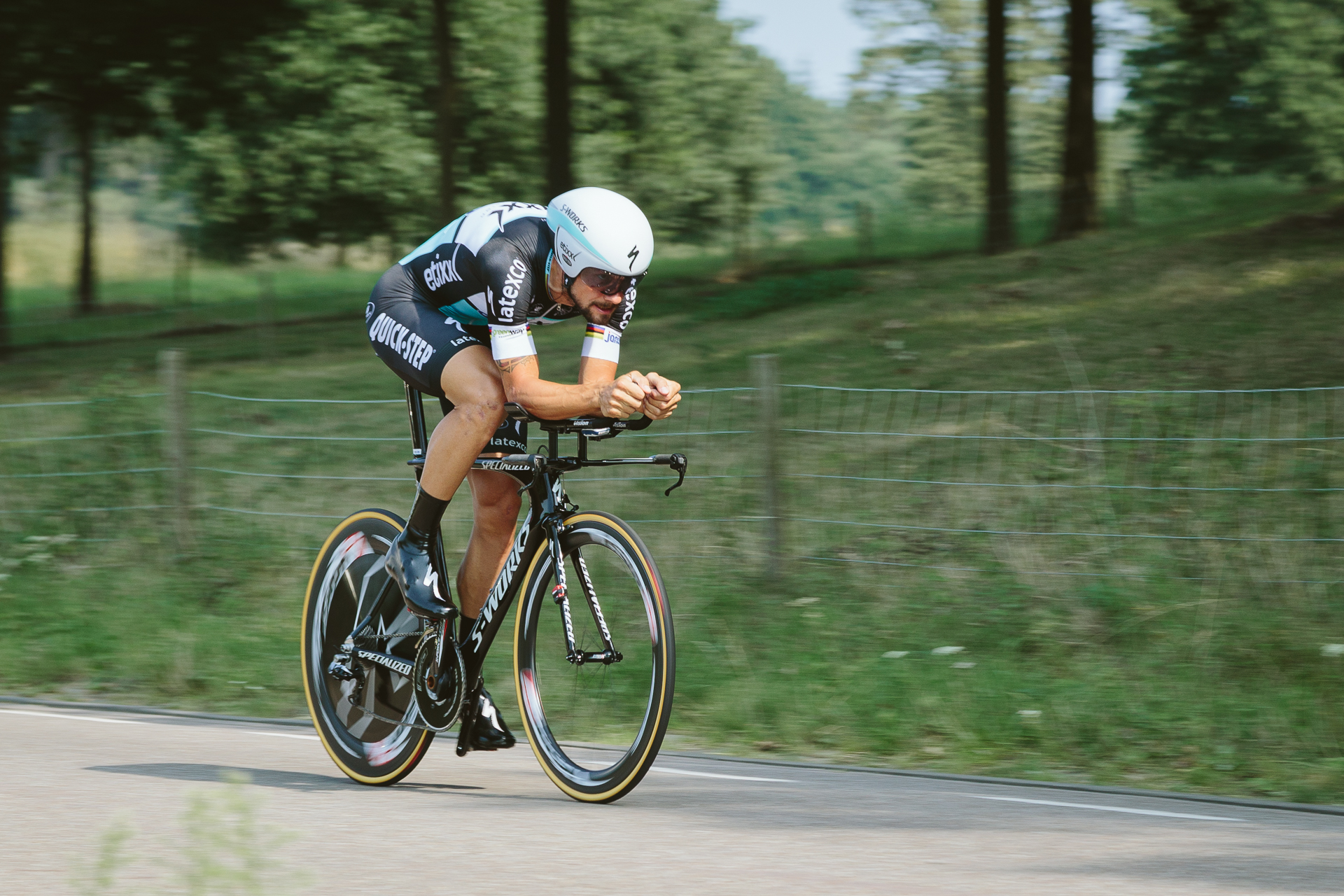
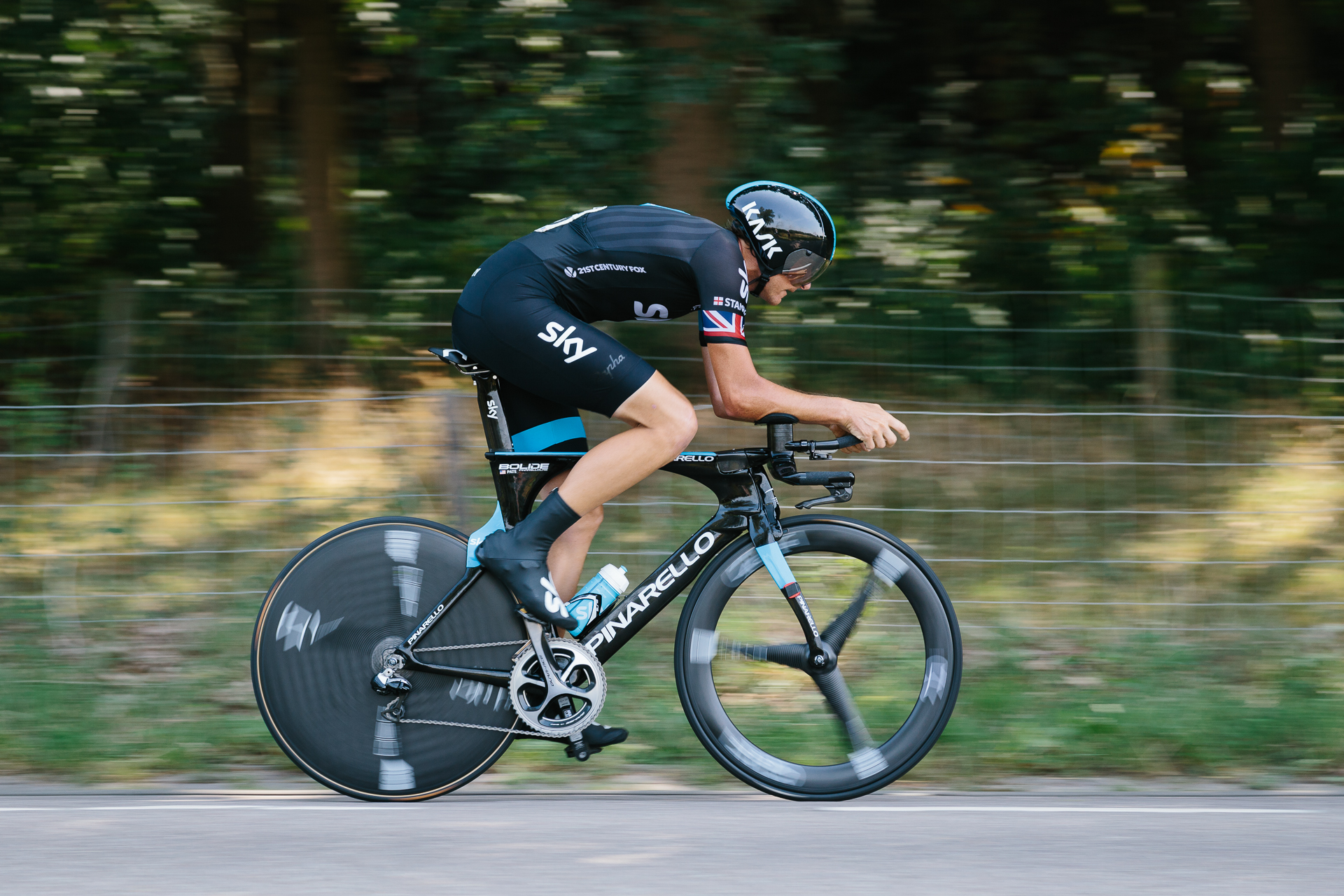
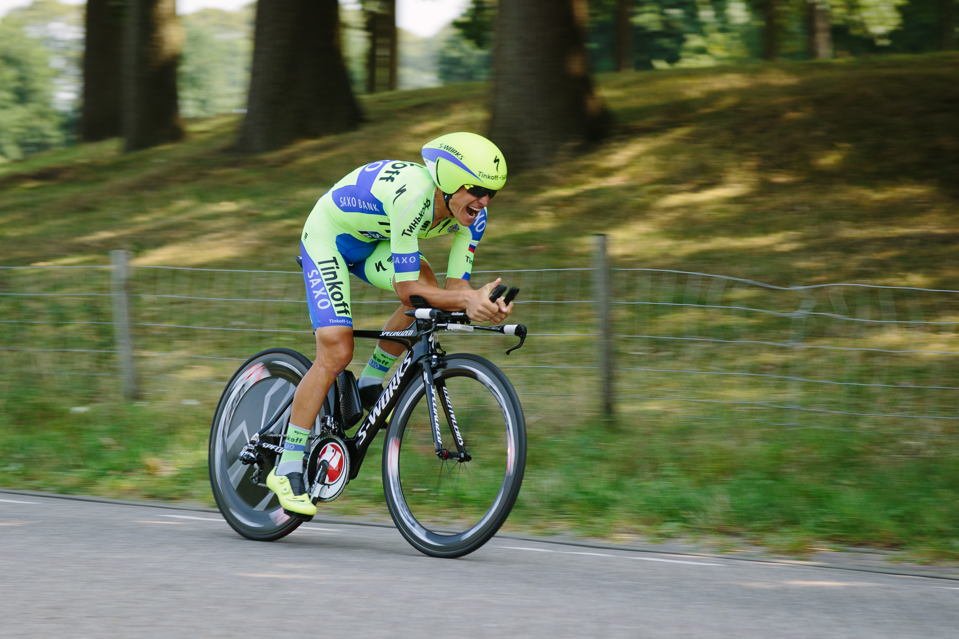
I was typically using a focal length of 105 mm (to isolate the cyclists from the background better, and to achieve a sense of speed without the need for too long exposure times), f/7.1 (not wide open at f/4, so a slight focusing error will not produce a totally out-of-focus image), an exposure time of 1/200 seconds, while the ISO was left at auto. Since I always use RAW, white balance and other settings were not taken care of on the spot, only during post-processing. I was shooting in burst mode, which is 4.5 frames/second on the Canon EOS 6D (compared to my more sport-photography oriented old 7D with 8 frames/seconds), using the central autofocus point only, and AI Servo tracking autofocus. The idea of panning photography is to follow the subject while shooting, this way even with relatively longer exposure times, you can keep the subject more-or-less sharp, while the background gets blurred from the motion of the tracked subject in the foreground. The difficulty is tracking the subject: 1) the tracking speed during the approach of the cyclist changes as the subject gets closer to you (think of standing at the side of a road and looking towards a car approaching towards you, while the car is still far, you don’t have to turn your head much, but while it passes in front of you, you will need to turn your head very quickly to follow through). 2) The cyclists were riding at 50 km/h, and I was standing only 5-10 metres away, so the tracking speed was really high when they passed. Even with an exposure time of 1/200 seconds, the cyclists have covered 7 cm during one exposure. For the image to be sharp, you need to track this movement with a half pixel accuracy. 3) The focus distance changes also very quickly as the cyclist approaches, which is very difficult to deal with for the autofocus system. I have taken more than 400 pictures during the stage, and almost 100 of these turned out to be technically all right (acceptably sharp). I would say that 65% of the bad pictures resulted from the tracking autofocus loosing the cyclist, while 35% from me not being able to track the movement precisely enough. Below you can find a small selection of the nicer images. It was a very nice experience, I am glad Nadia (and Clio) convinced me to go.

20150813_EnecoTT-1

20150813_EnecoTT-2

20150813_EnecoTT-3

20150813_EnecoTT-4

20150813_EnecoTT-5

20150813_EnecoTT-6

20150813_EnecoTT-7

20150813_EnecoTT-8

20150813_EnecoTT-9

20150813_EnecoTT-10

20150813_EnecoTT-11

20150813_EnecoTT-12

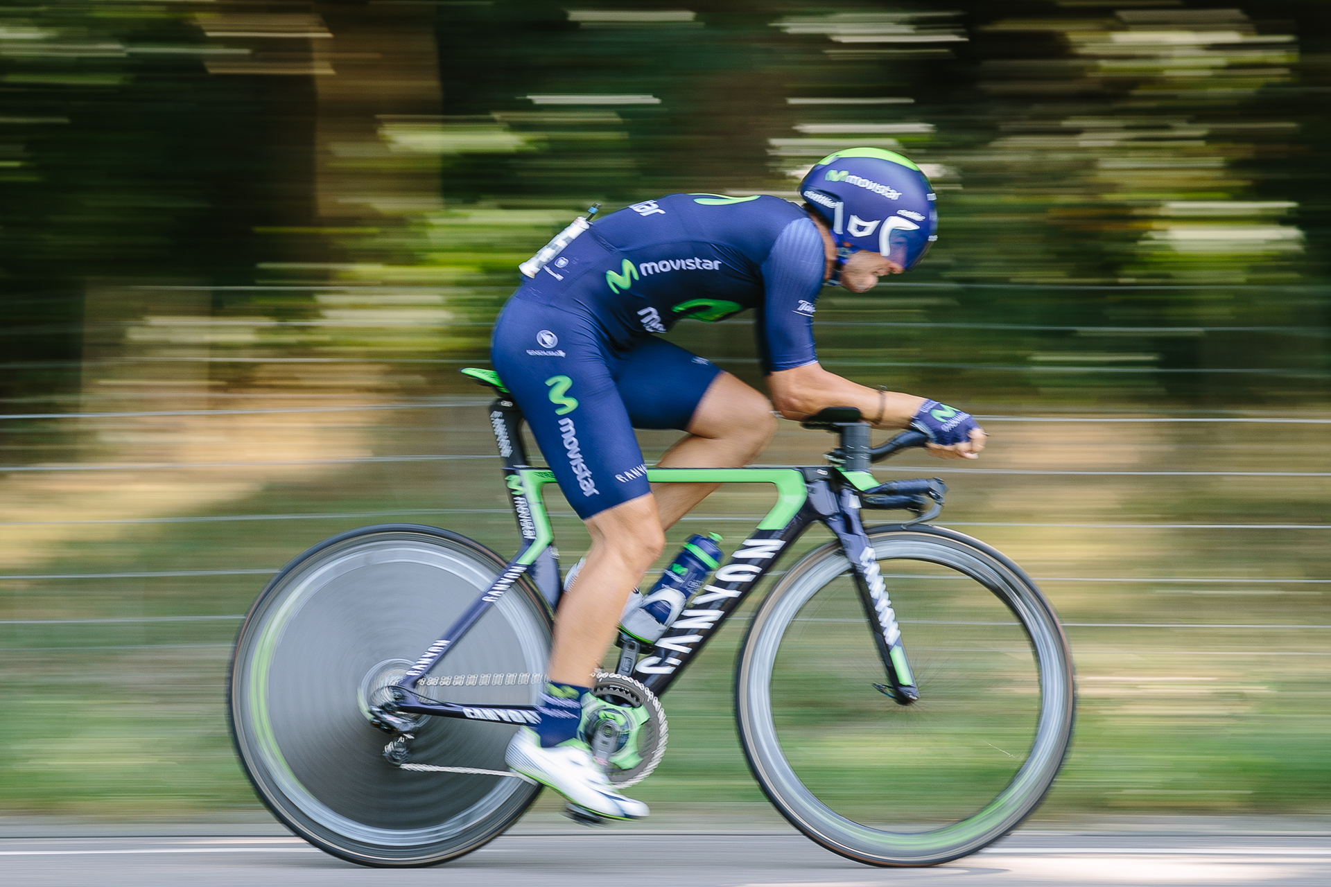
Just as an example (or a technology demo), here is one shot with a longer exposure time of 1/60 of a second (so the cyclist travelled 23 cm during the exposure). It is borderline impossible to follow such fast and extensive movement with a much better precision, so I am quite happy with this image too, even though I only tried one series with this setting, because the success rate was clearly lower compared to 1/200 seconds… Actually, you can see that a few cogs towards the top of the front chainring are perfectly sharp, meaning that I followed the movement of that part precisely.
20150813_EnecoTT-13

Designing a better map for outdoor activities with MapBox

A few days ago Strava (probably the most famous activity tracking app/site) unexpectedly switched from Google Maps to OpenStreetMap (OSM). The switch was most likely done to save money, and since it was executed completely unprofessionally, basically replacing the Google Map layer with extremely badly styled OSM data using MapBox, many people (including me) got pretty mad about it. The change should have been carried out after a proper test phase, asking feedback from (at least the premium, paying) users, building proper map styles, and communicating it to the community in a detailed, timely manner. Also, the biggest problem is not the switch to OSM, because it is a very welcome option especially for off-road cyclists and trail runners (when the OSM data is presented in a proper way – and this is the main topic of this post), but dropping Google Maps, and especially the removal of Street View. Street View was used by many of us to plan our rides (check road surface, traffic levels, segments, etc.), and to check out rides/runs of our friends on Strava, to see where they went. Google Maps can be replaced by OSM as I will show below, but there is just no alternative to Street View… (And then I did not even mention how much worse the satellite data provided by MapBox than Google Maps.) This is not what I expected from Strava, especially not as a paying customer… Anyway, let’s move on.

What do I want from a map (for planning rides, and viewing activities afterwards):

  1. Road network and environmental data: all the different road types (from highway to path), vegetation (forests, grassy areas, agricultural areas, etc.), water bodies, and so on.
  2. Topographic data: contour lines and shaded relief.
  3. Proper colour coding and style: it should not be too vivid, but no nearly indistinguishable watercolours either. Differentiate between different types with colour and line style (e.g., road hierarchy with colour, paved/unpaved or accessibility with line style). When the GPS track of the activity is plotted over the map, it should not get lost in the details around it (thus don’t use the colour in the map that you later want to use for the track). Colour coding and line styles should be consistent across all zoom levels. Labels should be clear, well readable, not too busy, not too sparse.
  4. Adequate level of detail (LOD) on all zoom levels, with smooth transition between levels (no huge jumps in data content or style between levels, fade in/out data if necessary). Trails should not be visible when looking at the full continent, but as you zoom in, more and more data should appear. Low-resolution data should be properly replaced with more local, high-resolution data where possible.
  5. Useful information: display data that is useful for the intended use of the map: bike lanes, cycle paths, MTB tracks, forest trails, paved/unpaved surface information, etc. Some points of interest are more interesting than others, thus give more weight to the interesting ones.

Where Strava clearly does not meet my expectations right now is point 3. And without proper style, no map can be good, no matter how good the data behind the map is. OSM is a bit like Wikipedia. It’s open, it can be edited by anyone, thus it is very easy to collect immense amounts of very specific geo data thanks to the broad user base, but of course it will have its problems too. While Google might not have some specific hiking trails, etc., it has a full global coverage, with proper quality control. OSM have regions with extremely good coverage, and then other regions where even main roads might be missing. On the other hand, OSM indeed has cycle paths, hiking trails, road surface information, and every tiny possible detail what the users manage to give in. (I just added our building with house numbers, the driveway, and corrected some roads in the Observatory on La Palma, and these changes showed up within a few minutes on the map. That’s cool of course.)

Of course this also means that the OSM data base is huge, so if you need a custom lightweight map (and connected/mobile applications need these), MapBox comes in handy. After creating a free account (which will limit you to one custom map and 50000 monthly map views, which is plenty enough for a single user), and installing the MapBox Studio software, you get easy access to a huge OSM and terrain database in the format of vector tiles. Then with some very basic CSS knowledge (and/or after reading some manuals) you can easily change the stile of the different vector layers and elements. You can customise the line stiles, colours, labels, POIs, icons, the displayed data, and even add your own data if necessary. Starting and learning from the provided examples it is actually very easy to fine-tune a map to your own needs (and taste). There are some serious caveats though. First of all, not all OSM tags are preserved when MapBox creates the tiles, which means that, e.g., a footpath across a park and a sidewalk actually gets the same class and type. This is annoying, because I don’t want to show sidewalks, but I want the trails through parks. Also, if there is a cycle lane and a small road which also holds a cycle path, although bot have the highway=cycleway tag, because the second have other tags too, it is converted as a path (a.k.a. a trail). And since the road surface information is also not transferred from OSM, it is impossible to differentiate between such an actually perfectly good paved cycling surface and a gravel trail. Also, I have found some strange cases where canals are nicely drawn in OSM, but in MapBox, they show up with a line… There are a few similar problems (elevation contour data around our place is like 100 m off, while it seems ok at other places), but the platform is really great.
I started from the Mapbox Outdoors layer, and modified that to end up with my custom style. In short, I have changed most of the colours, the contour lines and the topographic shading, made the road hierarchy more clear, cleaned up some zoom level transition issues, road constructions, added in glaciers, mountain peaks (with custom icons from another style), extra agricultural land use data, one way street signs, refined how water lands are displayed, and separated the island names from the common POIs. Here is an interactive version, feel free to zoom in and out and check out other places (especially some mountains, because we don’t have those here) too!


To make things even better, the creator of Veloviewer has added the option of having such a custom MapBox style on the site, so now I can actually see my cycling/running/hiking routes on this map! Awesome. That’s what I call great customer service. I use Strava for its social aspects, that I can see what my cyclist/runner friends are doing (which also helps me to discover new routes), and because I can compare my efforts on different road sections to others and to myself (which is always a nice motivation to train more), but when I want to track my yearly progress, I always go to Velowiever. It is a great extension to Strava. Now I am doing that more often to just look at my activities too, since it hurts my eyes to look at the dull maps on Strava. I hope the situation will improve, because one of the first reasons why I started using it was the nice, clean design of the site, and that it had everything I needed, but with ugly maps, I am not sure I should pay for the premium membership anymore. It is not giving me much extra anyway, as for the detailed analysis, I use Golden Cheetah anyway. For the yearly subscription fee I would expect innovation and new features, not loosing features like Street View. So they better start doing something besides optimising their profit…

Summer observing run on La Palma

I am sitting at the airport of La Palma waiting for my hopefully not very delayed flight to Madrid (a bit of delay is ok, but I still want to make it home today), so I have a bit of time to post. I spent the previous almost two weeks (officially 10 nights) working at our Mercator Telescope, and as this time I did not come without my photography equipment, I also took a few nice pictures in my spare time. It has been so long since I took proper pictures here, that I finally had some new ideas and it did not feel like a burden to take photos. So please enjoy the following selection, and should these be not enough, head over to the full gallery on flickr.

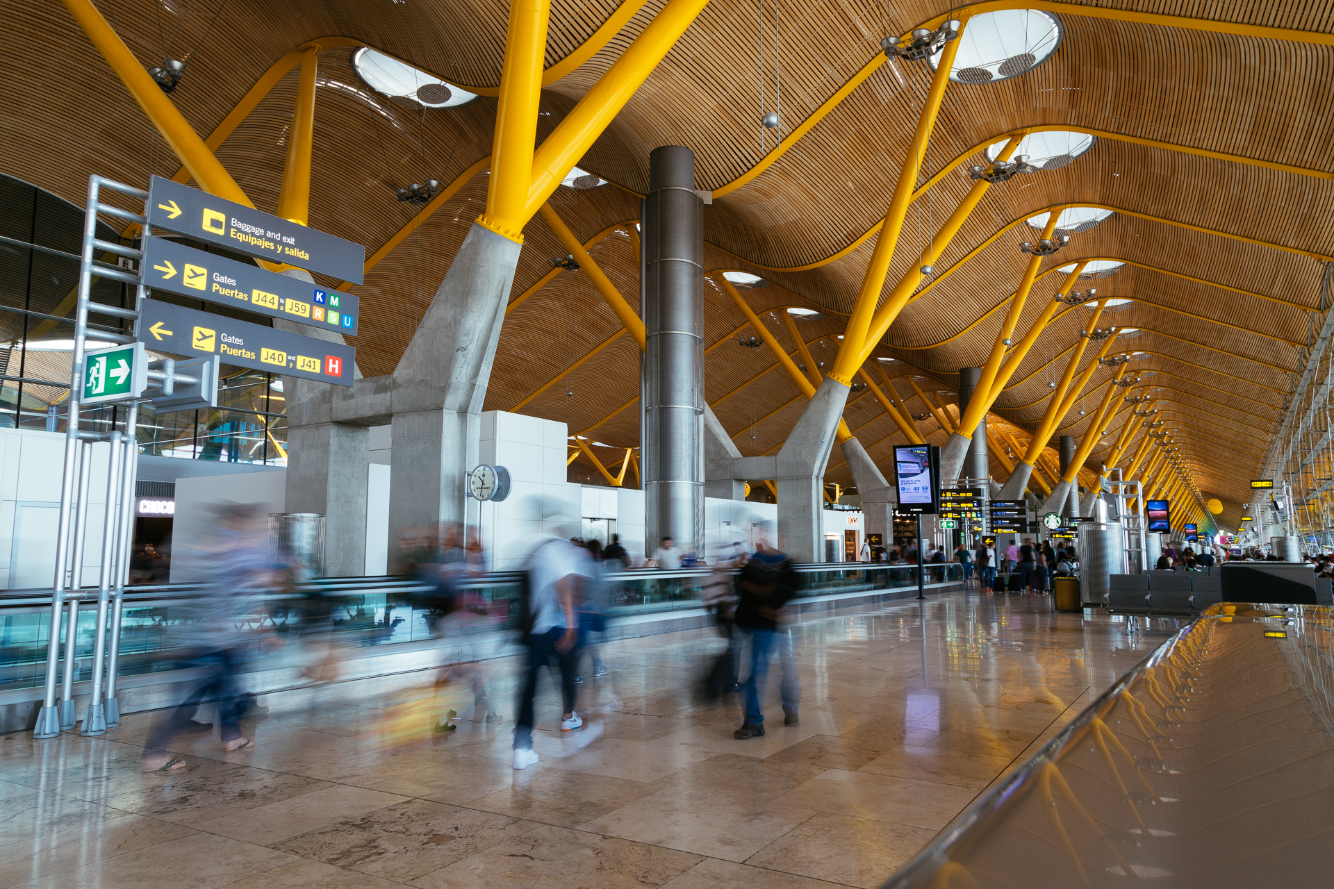
2015_LaPalma-1

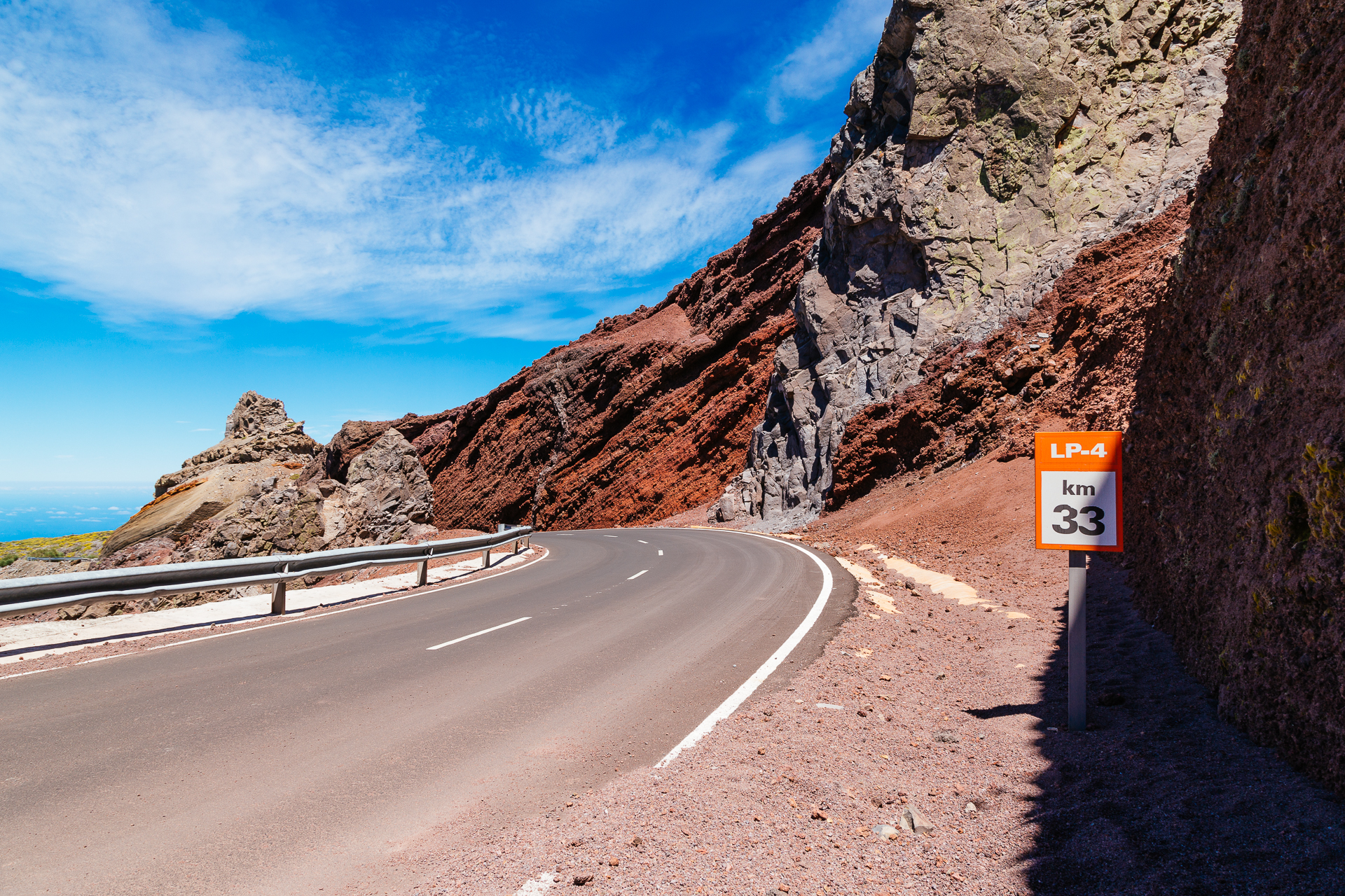
Flying to La Palma, if it’s not on a day when charters fly, you will most likely catch a connecting flight in Madrid. I like the colours of this airport a lot. then after landing on La Palma, it’s a one hour taxi ride up from sea level to 2145 meters to the Observatory. The amount of curves along the way is just crazy, so you should keep your eyes on the road…

2015_LaPalma-2

2015_LaPalma-3

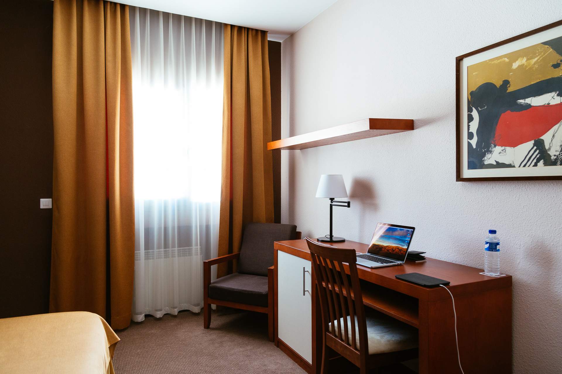
At the observatory astronomers stay at the residencia. It is basically a small hotel with cozy rooms that can be made totally dark even during daytime (which is pretty much the most important thing when you need to sleep during the day).

2015_LaPalma-4

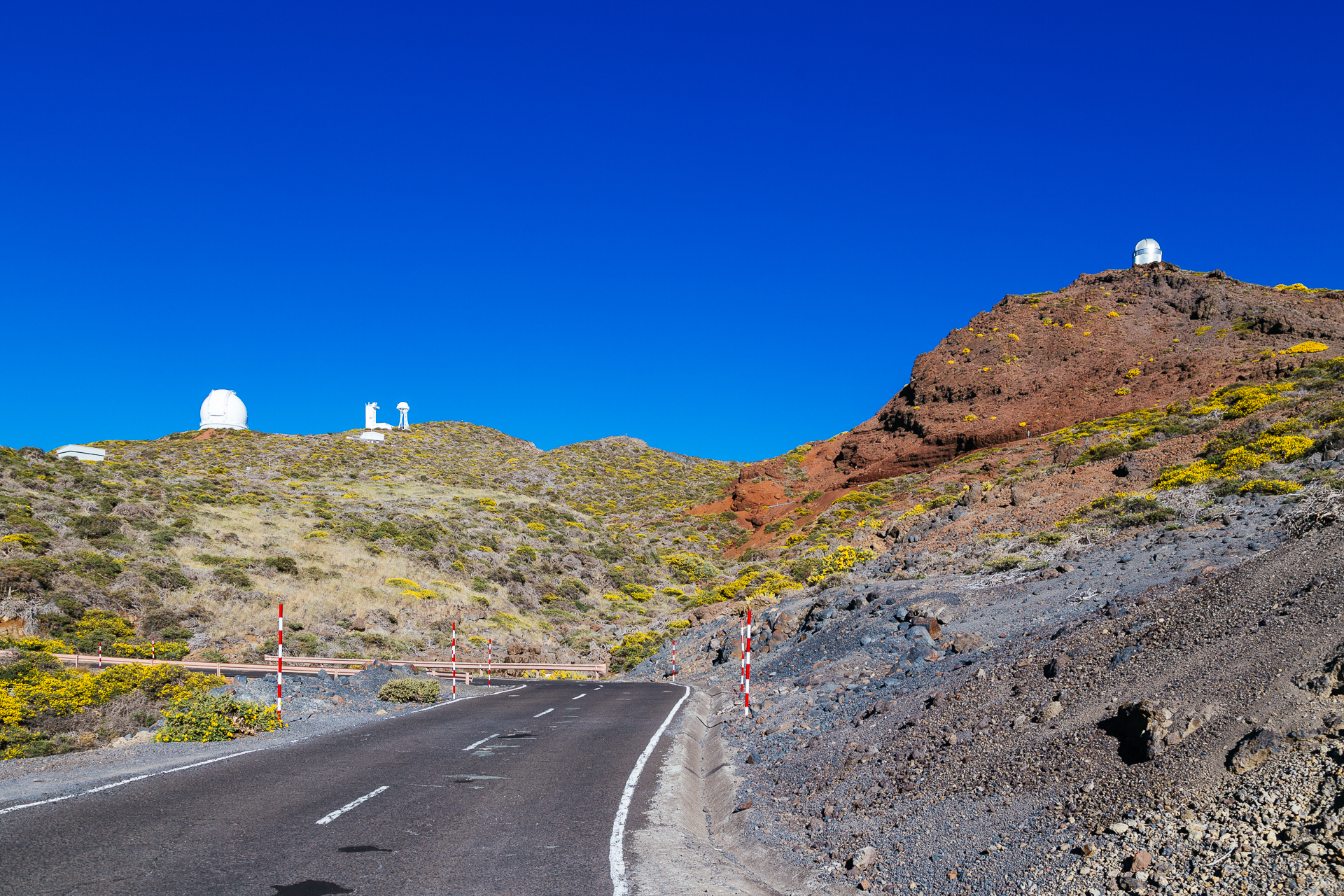
This is the first time that I came here at the beginning of the summer, so I finally got to see the sea of yellow flowers on the mountain. Especially in very clear days (so, basically every day here), they are really beautiful against the deep blue backdrop of the sky.

2015_LaPalma-5

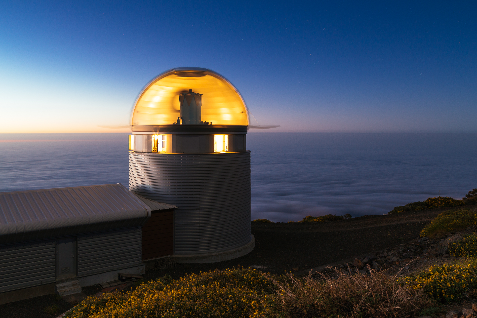
I made an improved version of my famous transparent dome photo, which took a lot of preparations, and running between the control room an the camera. You can read more about the process in my blog post for the old picture.

2015_LaPalma-7

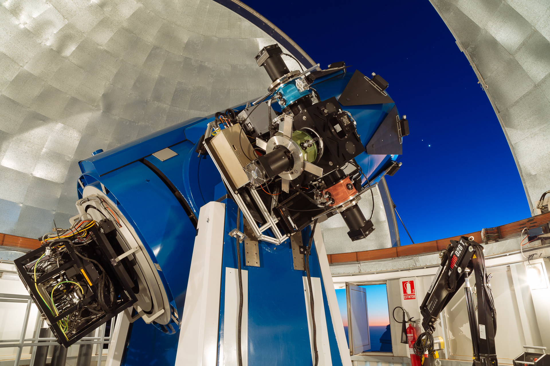
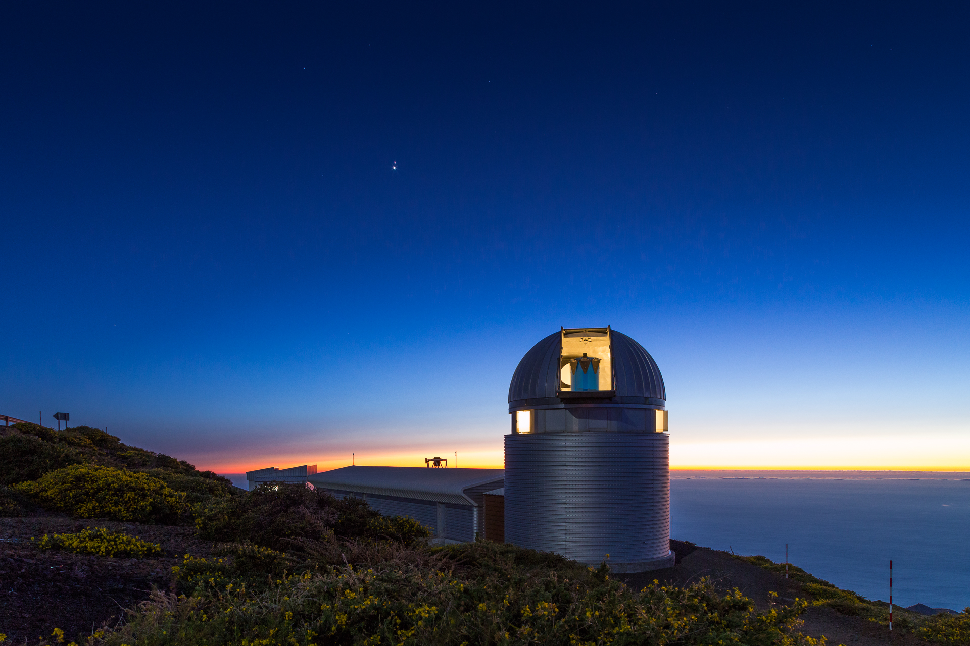
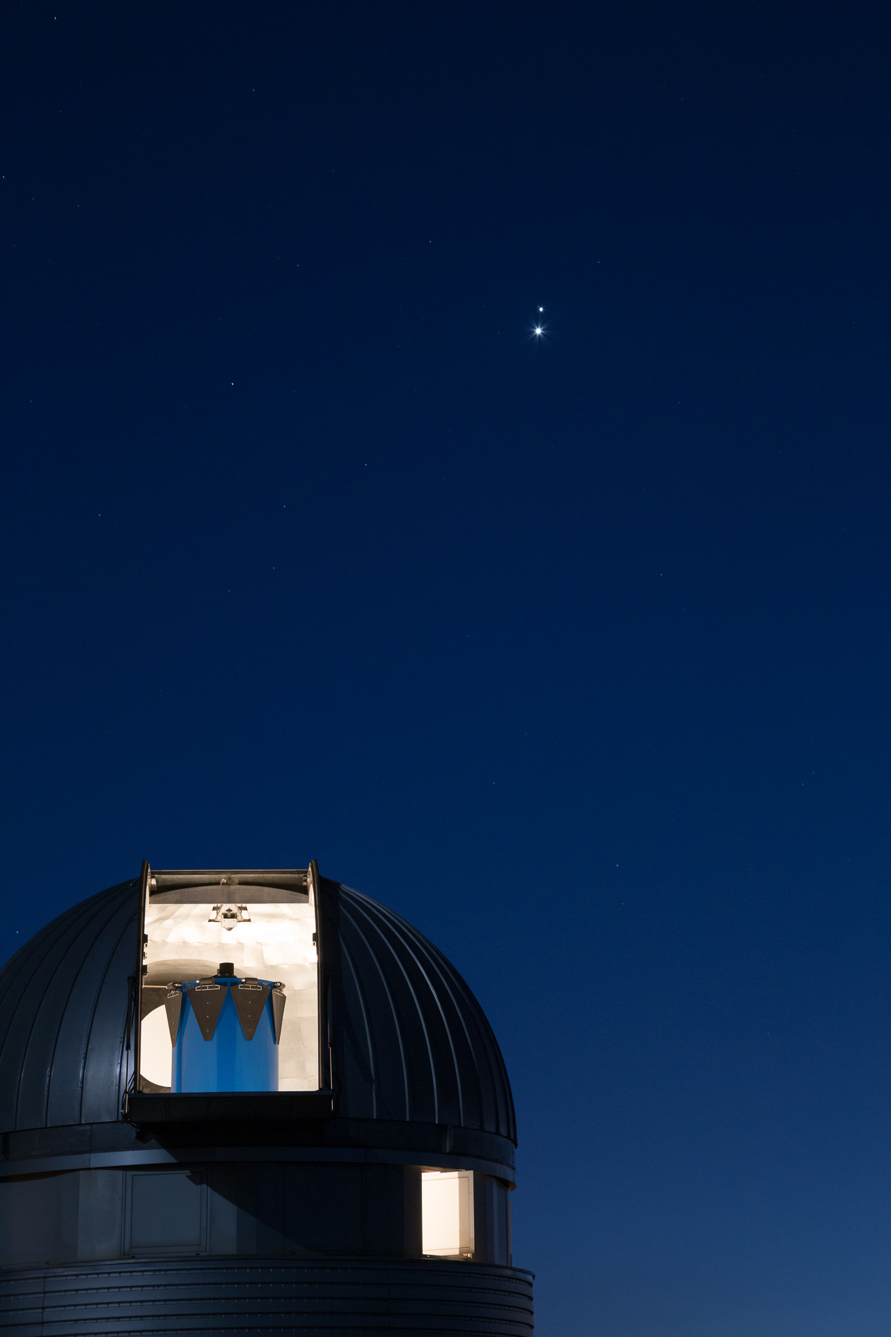
I was lucky because Venus and Jupiter came unusually close to each other on the evening sky during my stay, so I had something special to put in the background of the telescope (or the building). Note our new simultaneous three channel (hence the three colours on its sides) photometer (MAIA) on the side of the telescope.

2015_LaPalma-8

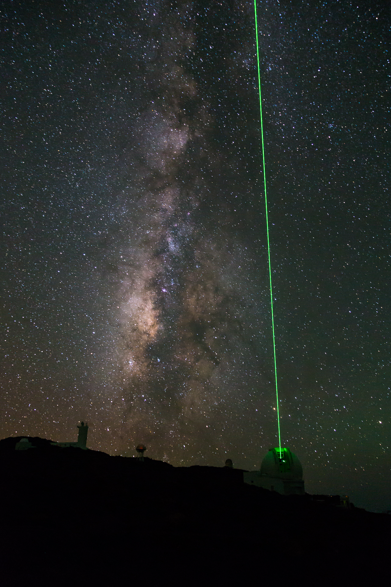
I also got to see the laser of the WHT in action. This was actually already the second time that I saw it, but last October I had no camera with me to take pictures. Also, now I could put the Milky Way in the background :)

2015_LaPalma-6

When I said Venus and Jupiter had a pretty close conjunction, I meant they had an apparent distance less than the diameter of the Moon! It was an amazing visual sight.

2015_LaPalma-9

2015_LaPalma-10

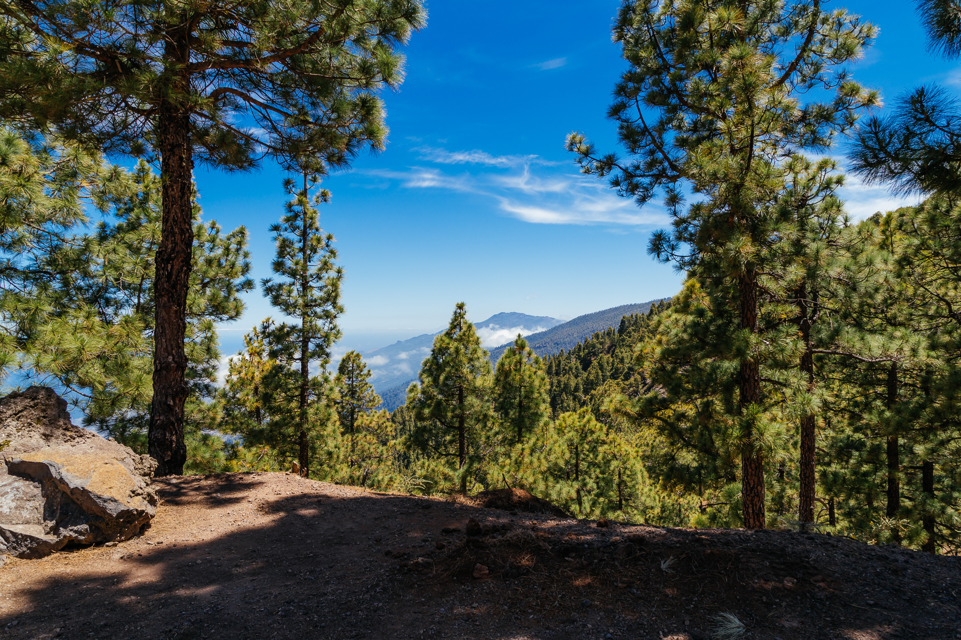
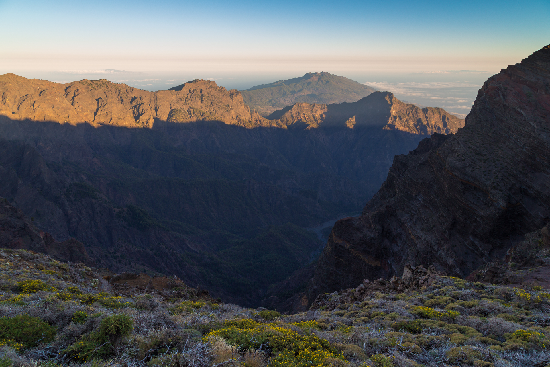
Then of course there is the famous caldera of the island, which is usually filled with a sea of clouds, but there are also a few rare days, when you can see down all the way to the bottom.

2015_LaPalma-11

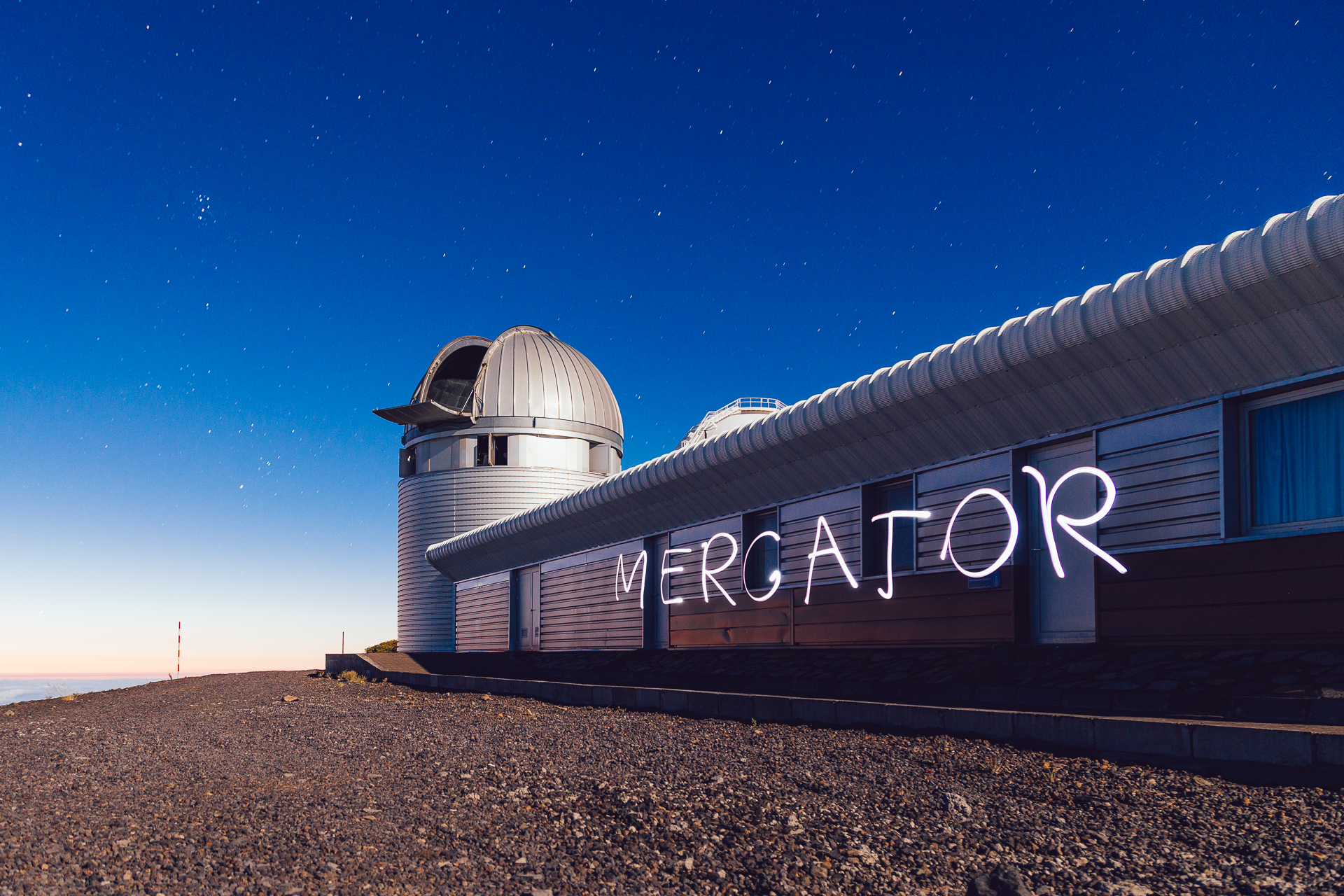
On one of the last nights I had some fun with light-painting, writing the telescope’s name with a flashlight on a long-exposure image. BTW the rest of the scenery is lit by moonlight.

2015_LaPalma-12

2015_LaPalma-13

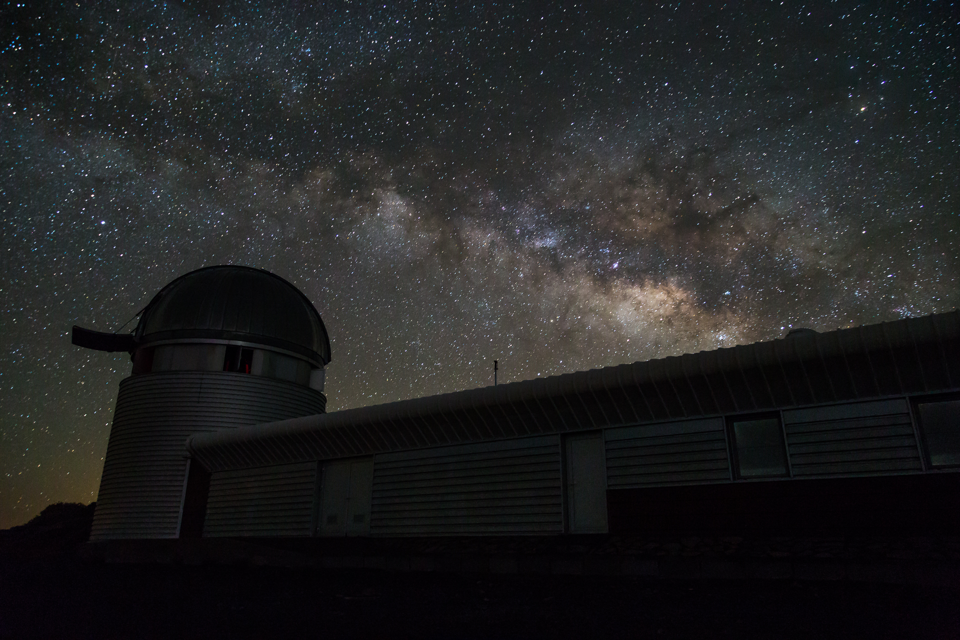
Then on the last day, I could still catch our home galaxy rising behind the telescope building in the short dark time between sunset and moonrise.

2015_LaPalma-14

I will be back in October with the Master students as usual, but probably without photo-equipment. I have taken enough nice pictures for a while.

2015_LaPalma-15

Holidays in Copenhagen, conference in Aarhus

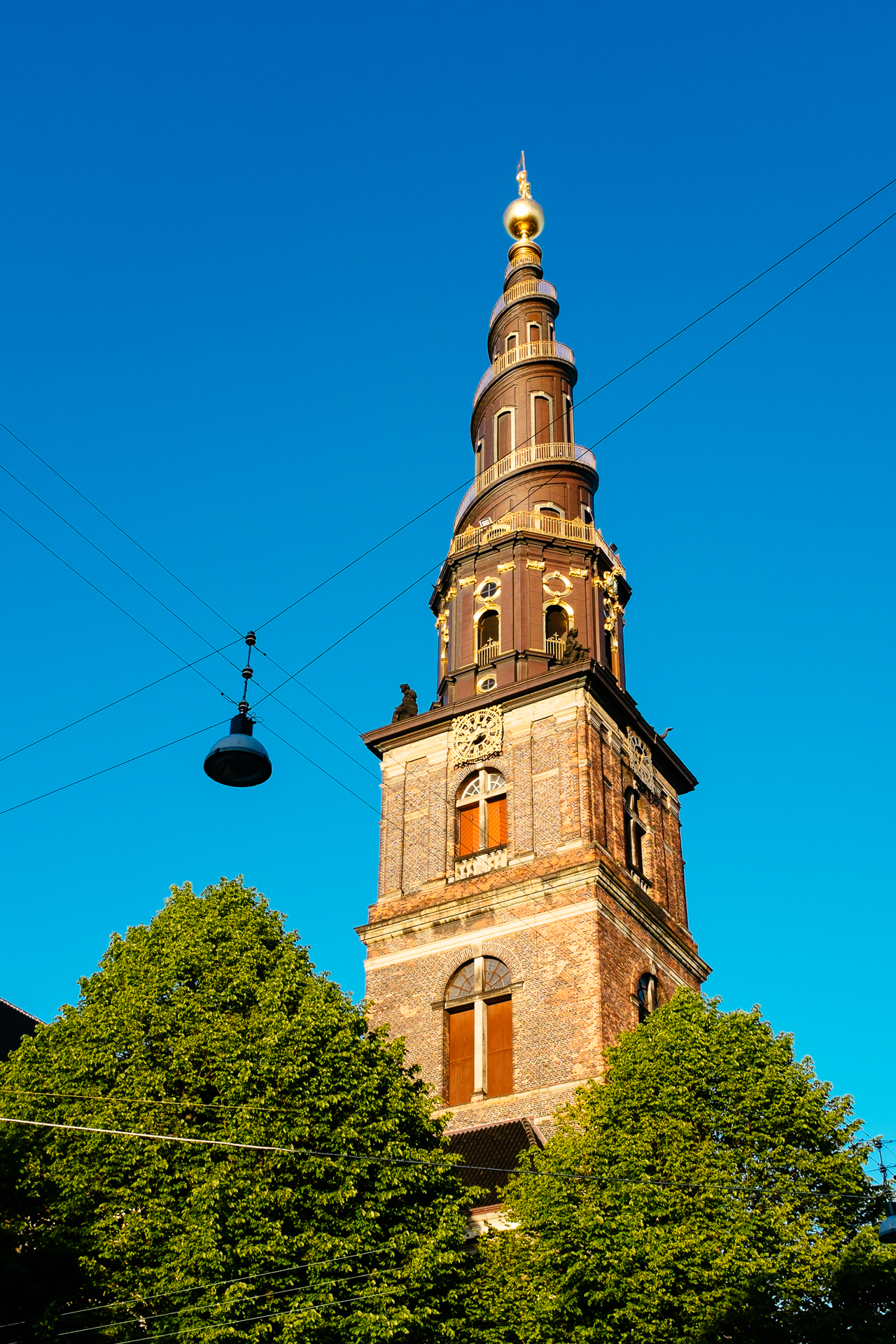
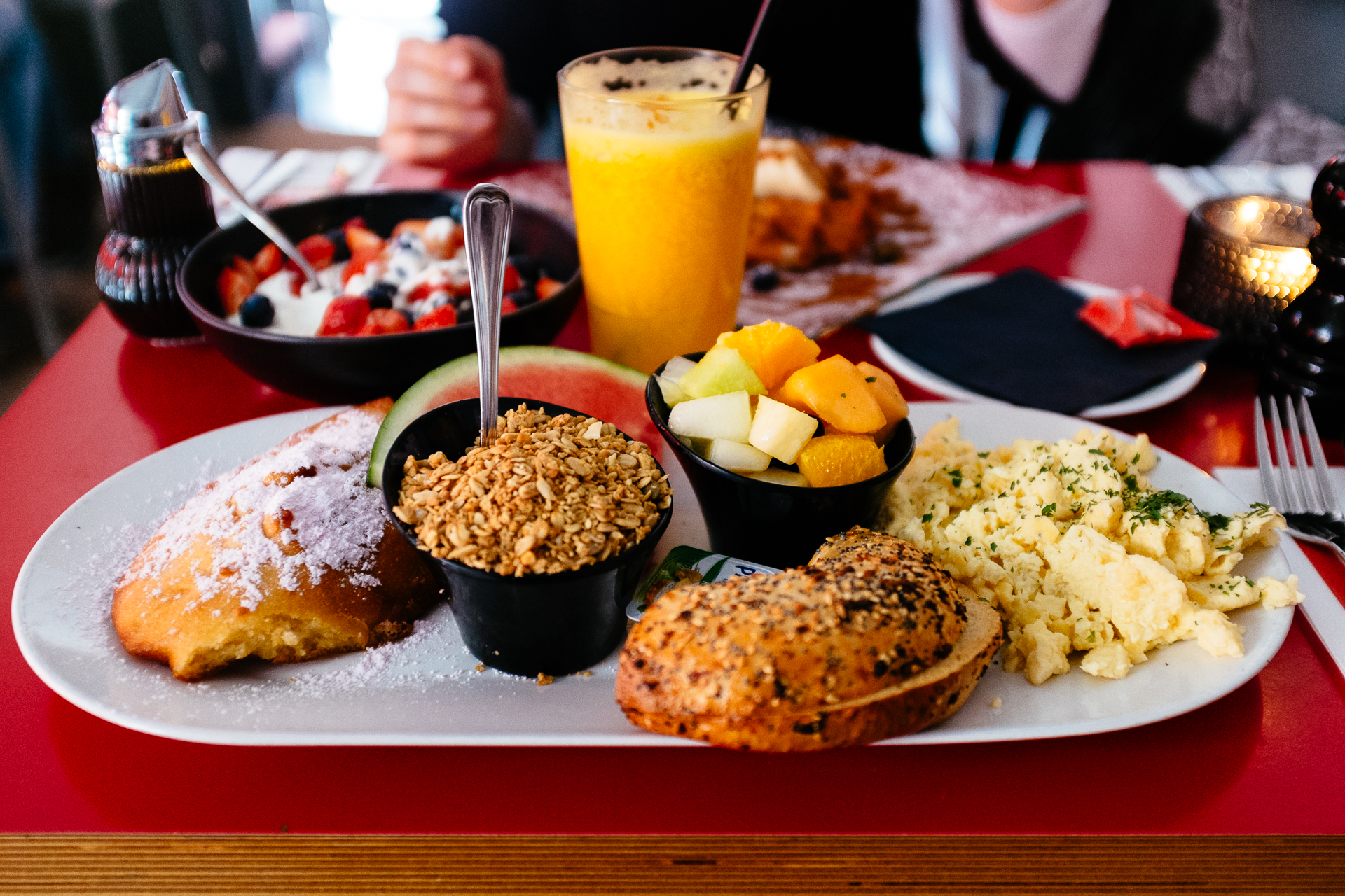
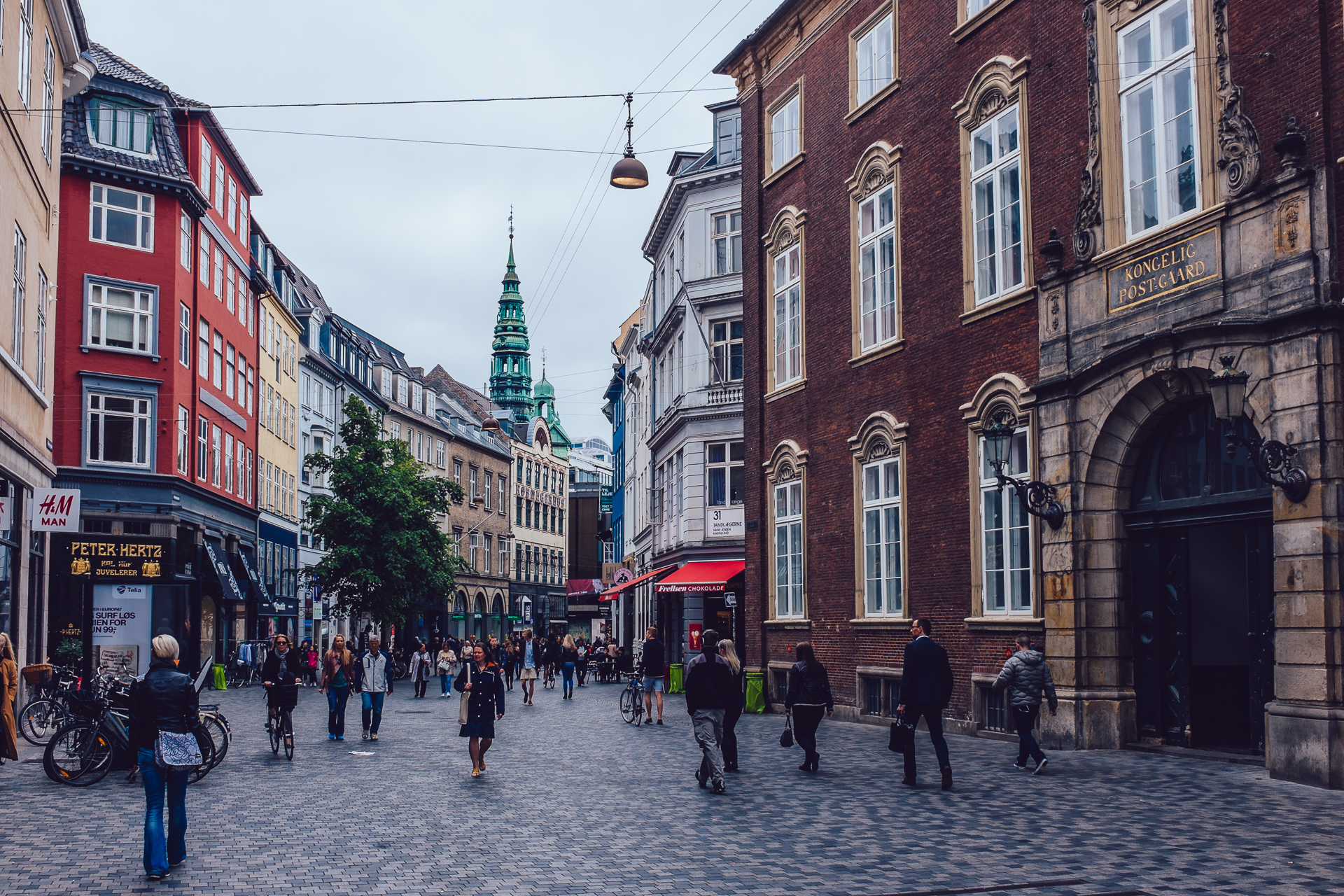
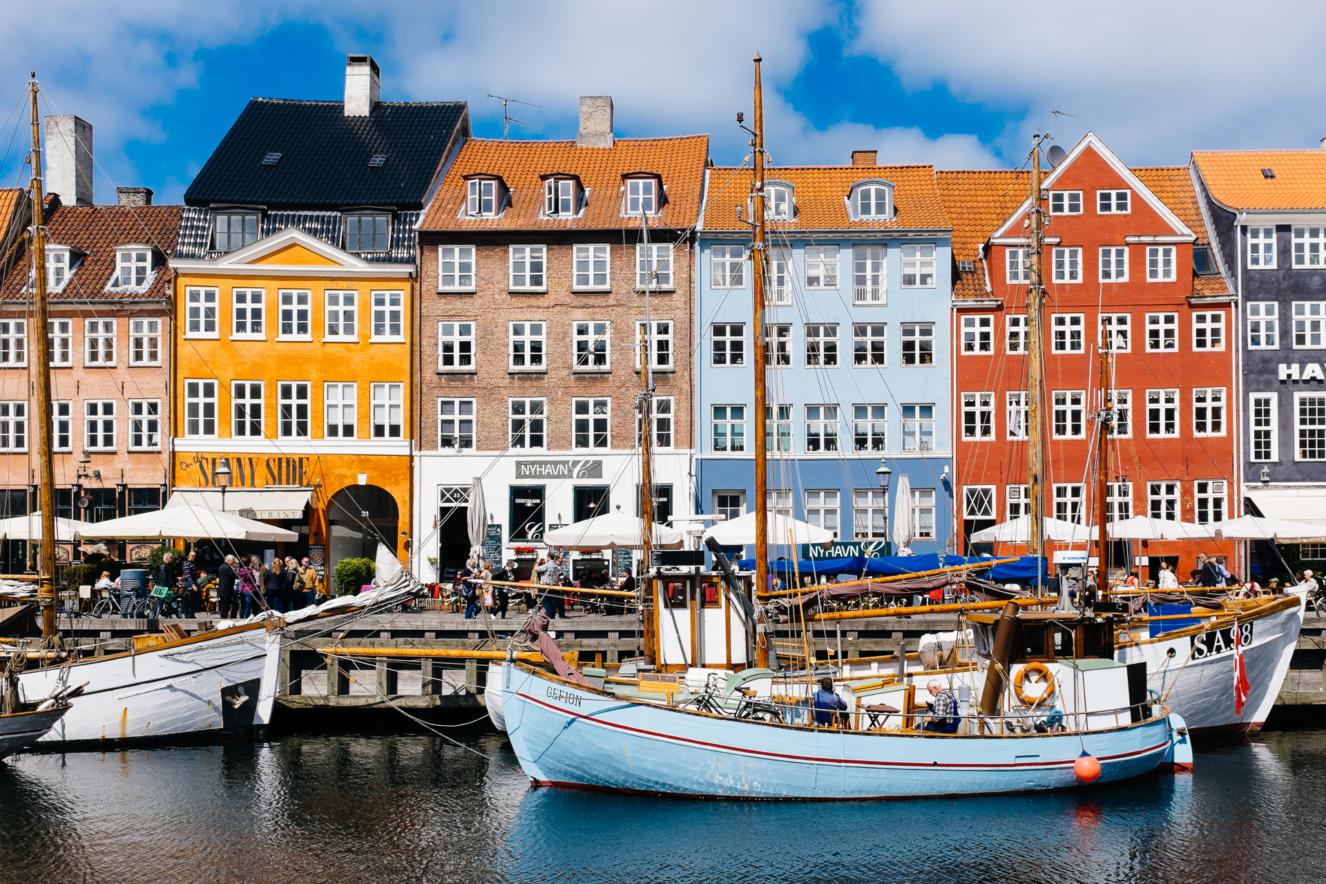
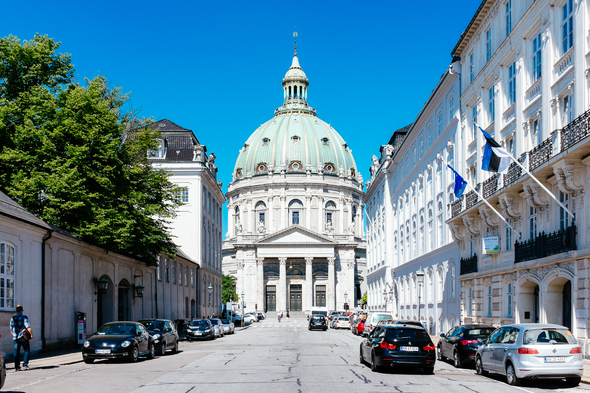
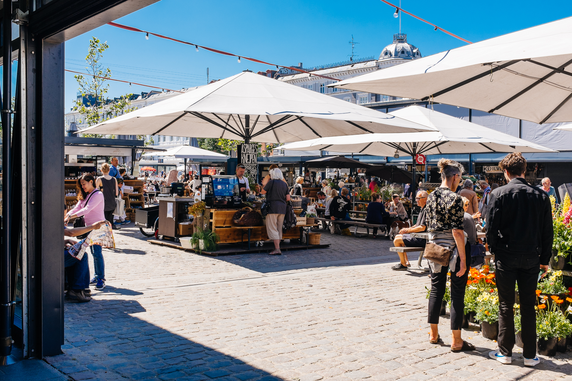
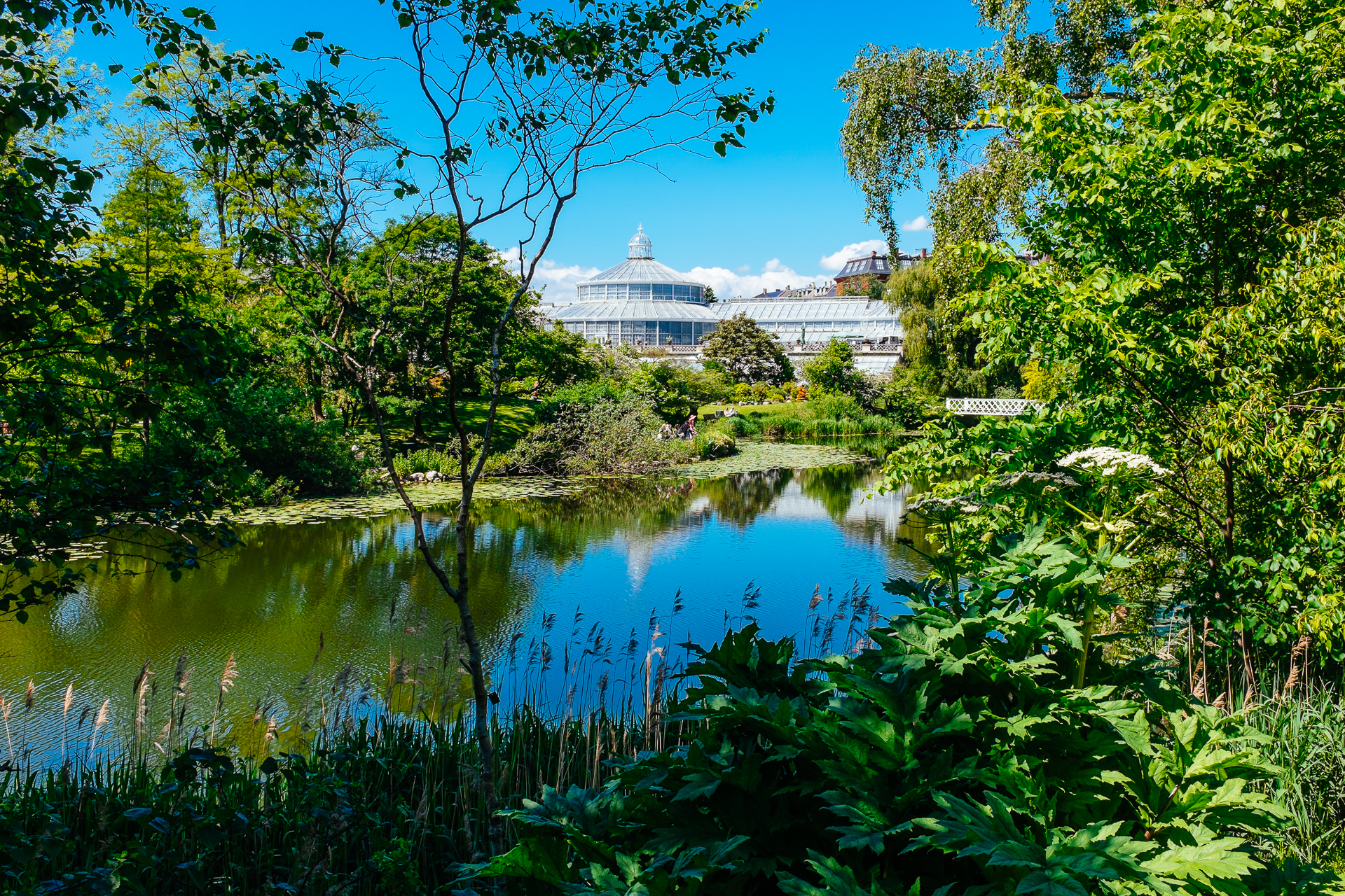
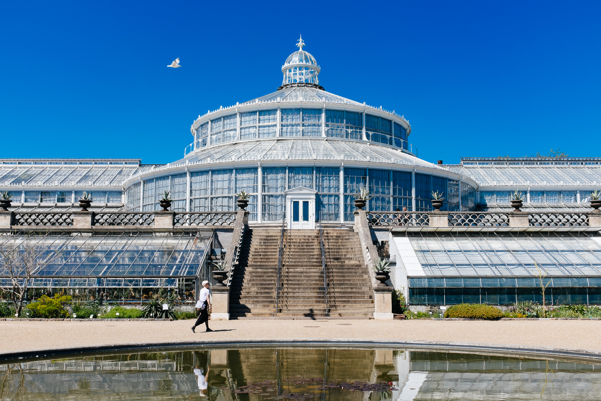
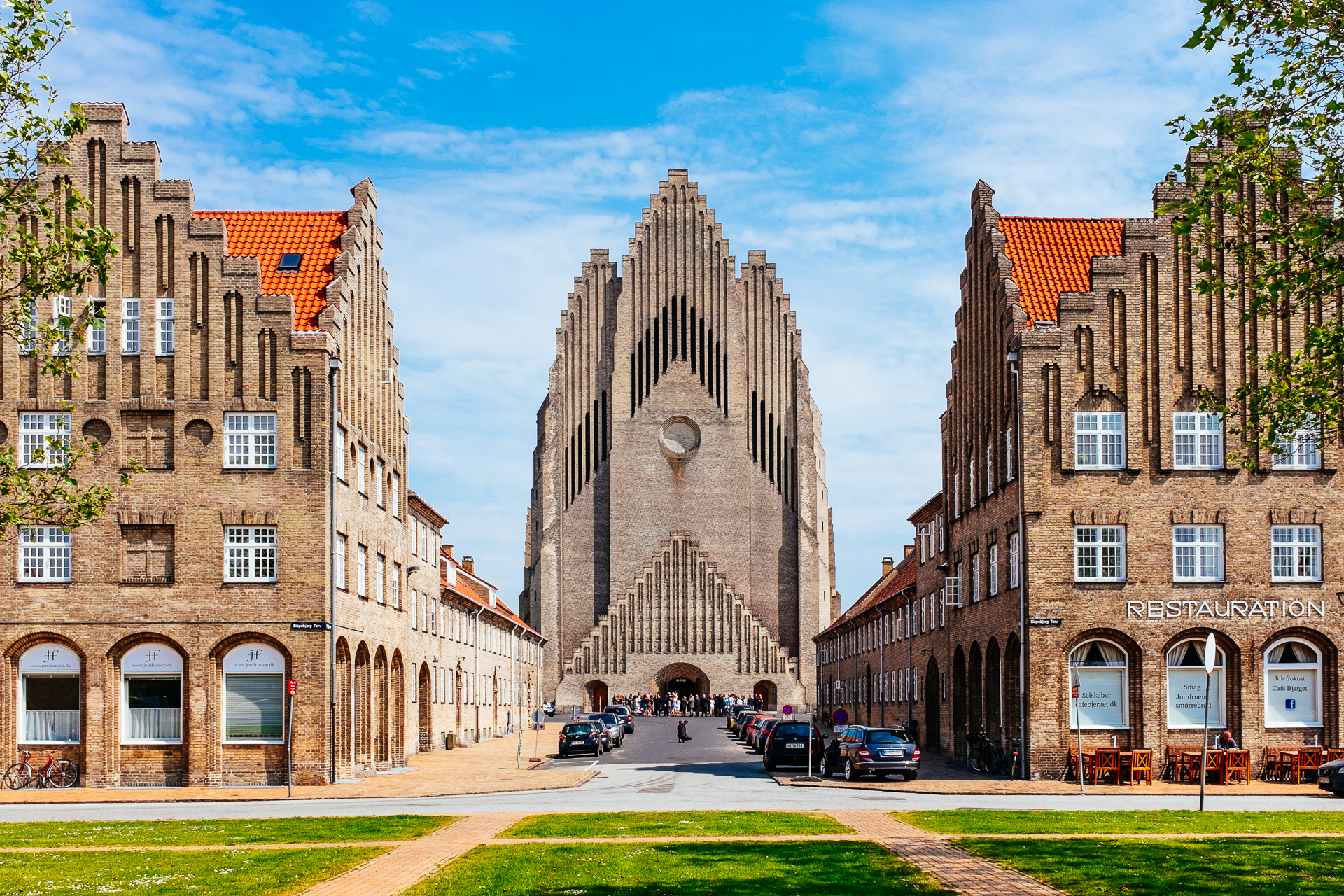
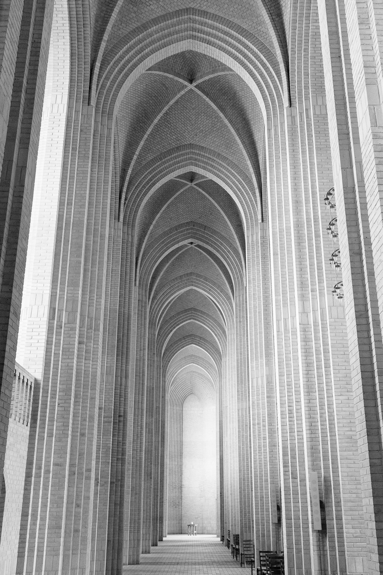
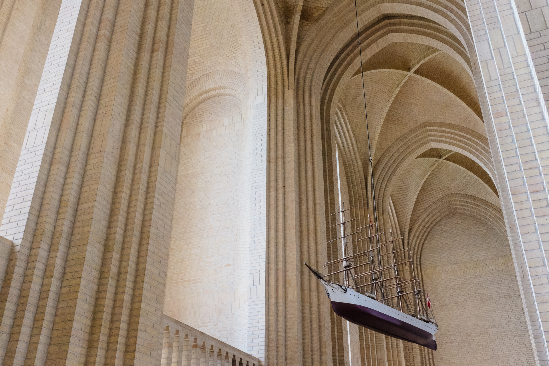
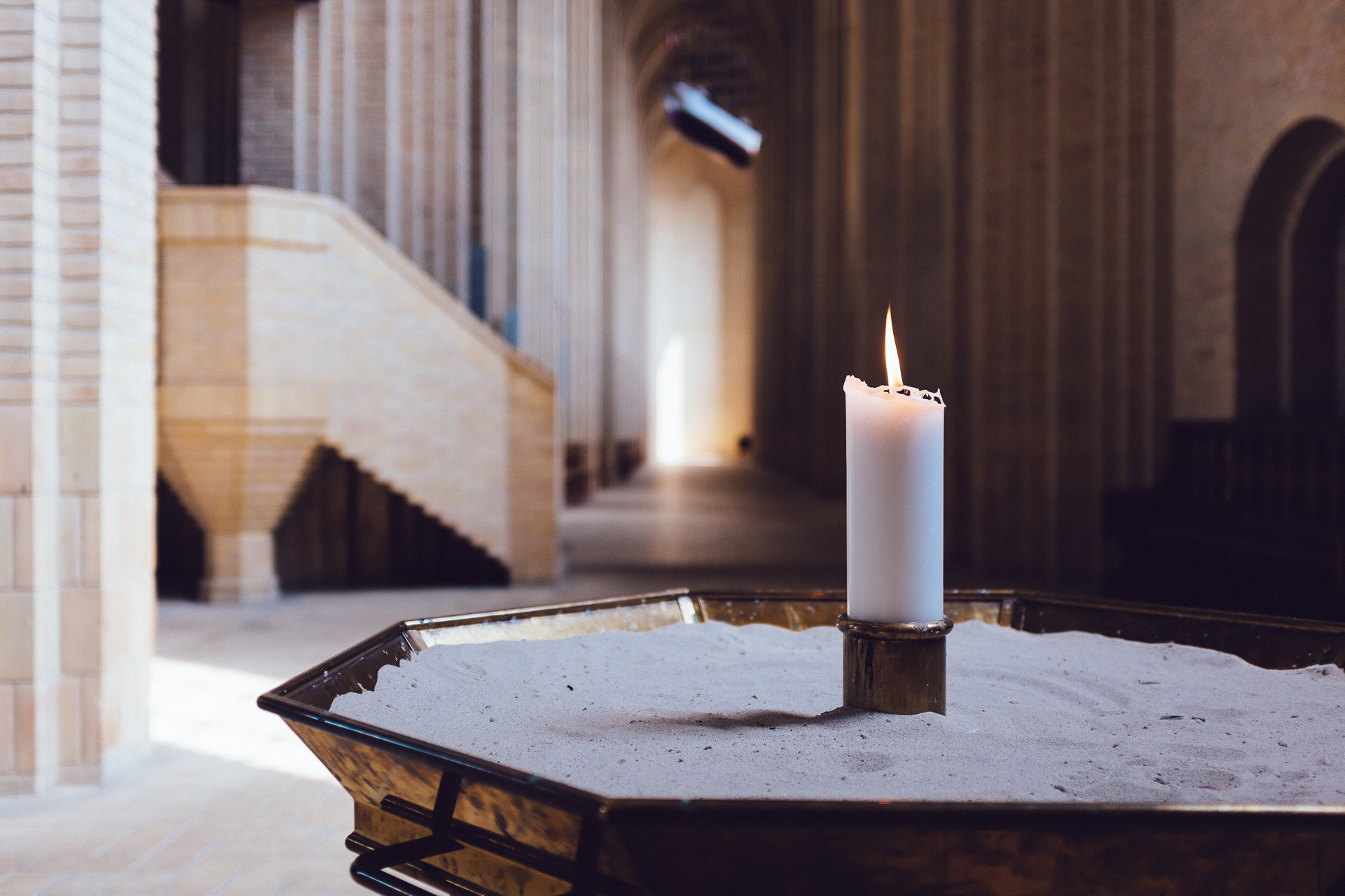
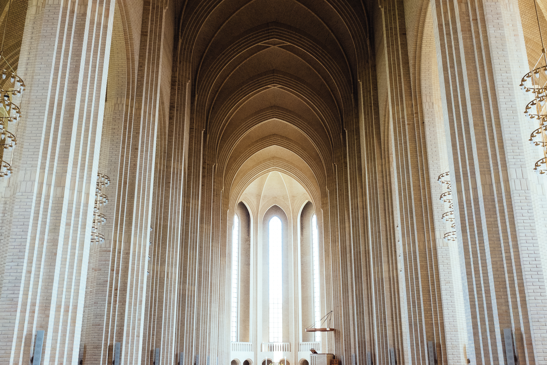
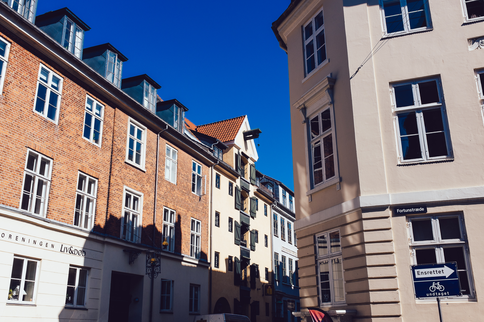
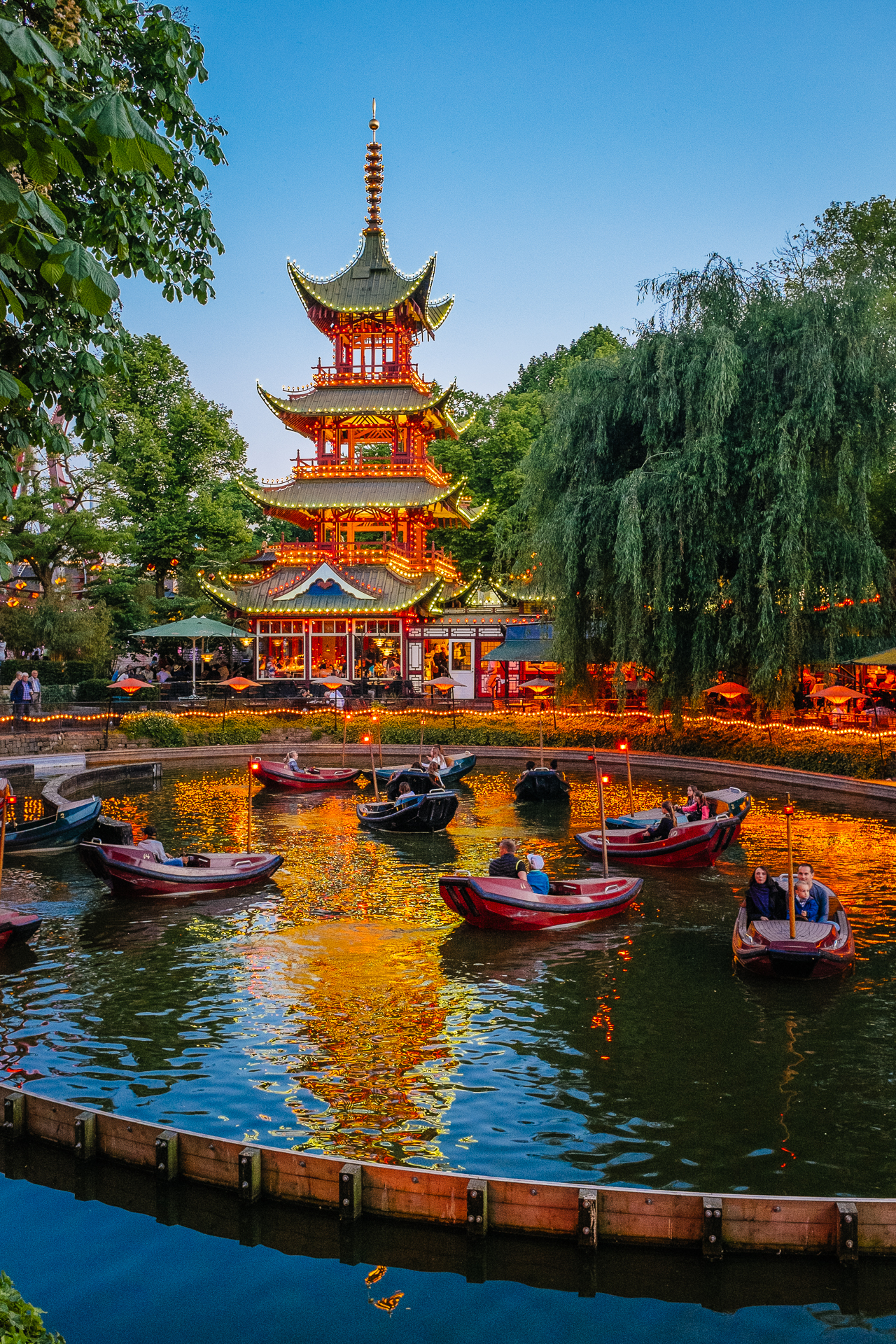
Five years after the hugely successful Third Kepler Asteroseismology Workshop, the annual KASC meeting (or to be precise, the KASC8/TASC1 Workshop) was held in Aarhus once again. Before going to the conference, we had taken a few days off to visit Copenhagen. We had very nice weather (especially compared to what I had had to endure later in Aarhus), and a nice airbnb apartment (if you don’t count the lack of dark curtains in the bedroom, which can be a bit annoying around the summer solstice in Denmark) not too far from the centrum. Most of our time was spent walking around in the city, especially on the 2nd day which we finished with more than 36000 steps, so we could spend all the money we saved by not using public transportation on nice food here and there (Luna’s Diner for breakfast, PapirØen for all the different kinds of street food, and Bertels Salon for the best cheesecakes). At the end, I think Clio liked the Tivoli Gardens the most, while I really loved Grundtvig’s Church.

2015_Denmark-1

2015_Denmark-2

2015_Denmark-3

2015_Denmark-4

2015_Denmark-5

2015_Denmark-6

2015_Denmark-7

2015_Denmark-8

2015_Denmark-9

2015_Denmark-10

2015_Denmark-11

2015_Denmark-12

2015_Denmark-13

2015_Denmark-14

2015_Denmark-15

2015_Denmark-16

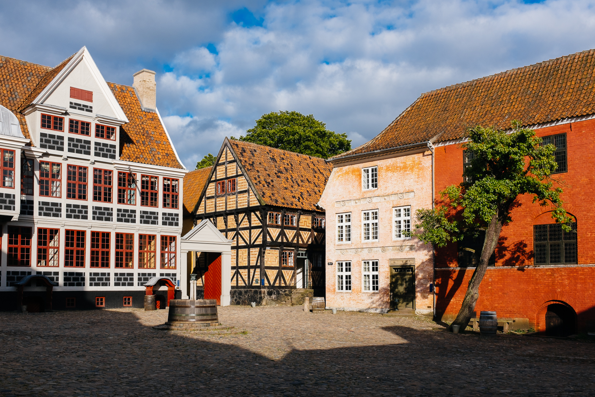
Then while Clio flew home, I took the train to Aarhus. It was a long ride, but comfortable, and there was also free wifi, so I guess I have no reason to complain. Then in Aarhus I had the most cozy and clean airbnb apartment ever for less money than what the most crappy hotel (which I have already tried 5 years ago) would have been, and only a 5 minute walk away from the conference venue. The meeting itself was good as usual, and I again got the opportunity to present my (and my collaborators’) results in a 15 minute talk (‘Scanning the seismic barcode of SPB stars – Asteroseismic fingerprints of rotation and mixing in the slowly pulsating B stars viewed from space’), which went also fine. Due to the horrible weather, I did not attend the excursion (to climb one of the highest ‘mountains’ in Denmark), but as soon as the sun came out (and the temperature climbed to 14°C) I went for a 10k run. The conference dinner was served in The Old Town, a nice open-air museum of old Danish buildings.

2015_Denmark-17

Since the coffee breaks were filled with cakes, I gained a bit of weight (almost 2 kilograms to be precise), but with all the cycling (and running), this should not be a long-lasting issue. For even more pictures, click here.

My 6th “first-author” paper is accepted for publication

My life is not only about cycling and photography, but I actually work too. I have written down the latest results from my research in a paper entitled Asteroseismic fingerprints of rotation and mixing in the slowly pulsating B8 V star KIC 7760680, which is now accepted for publication in the The Astrophysical Journal Letters. The accepted draft can be found on arxiv.org. Enjoy reading it ;)

20150403_6thpaper